Components API
- Turnkey
- Embed-SDK React
- Embed-SDK Web
Provides API for granular overriding of various aspects of the App Builder user interface ranging from entire screens such as the “VideoCall” screen to specific components within these screens such as the “BottomBar” component.
The overrides are applied by supplying values as an object under the top-level components key to the Customization API config object.
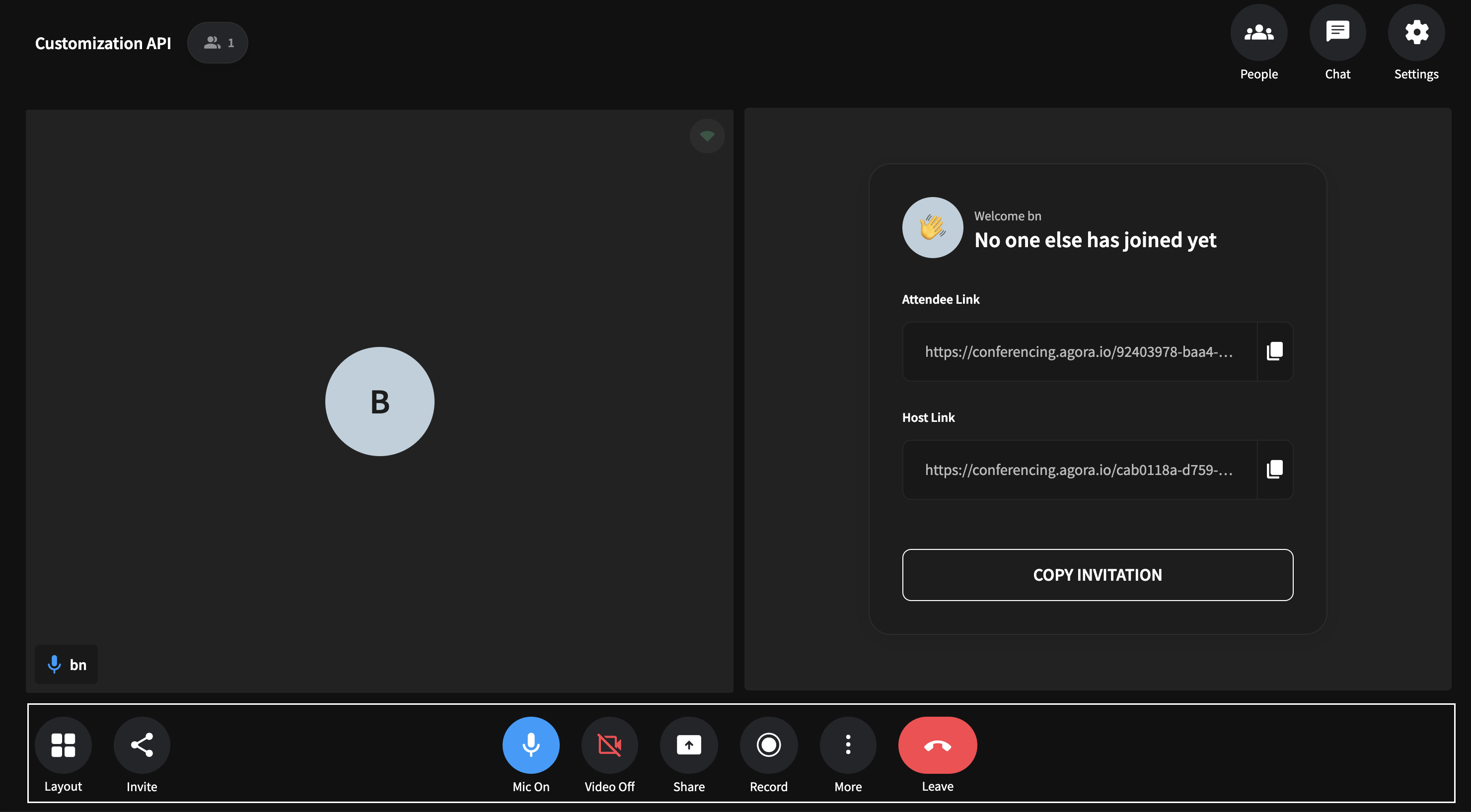
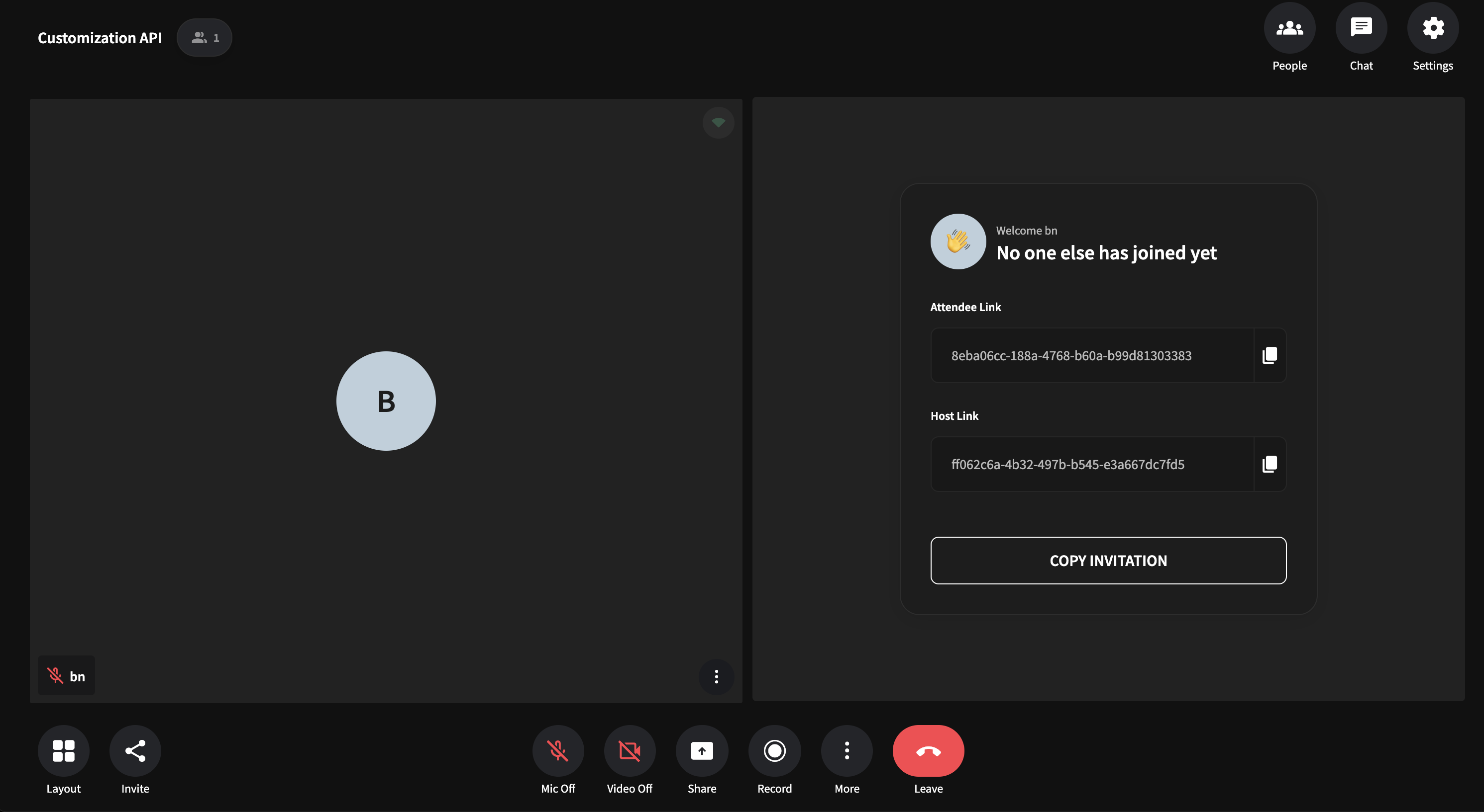
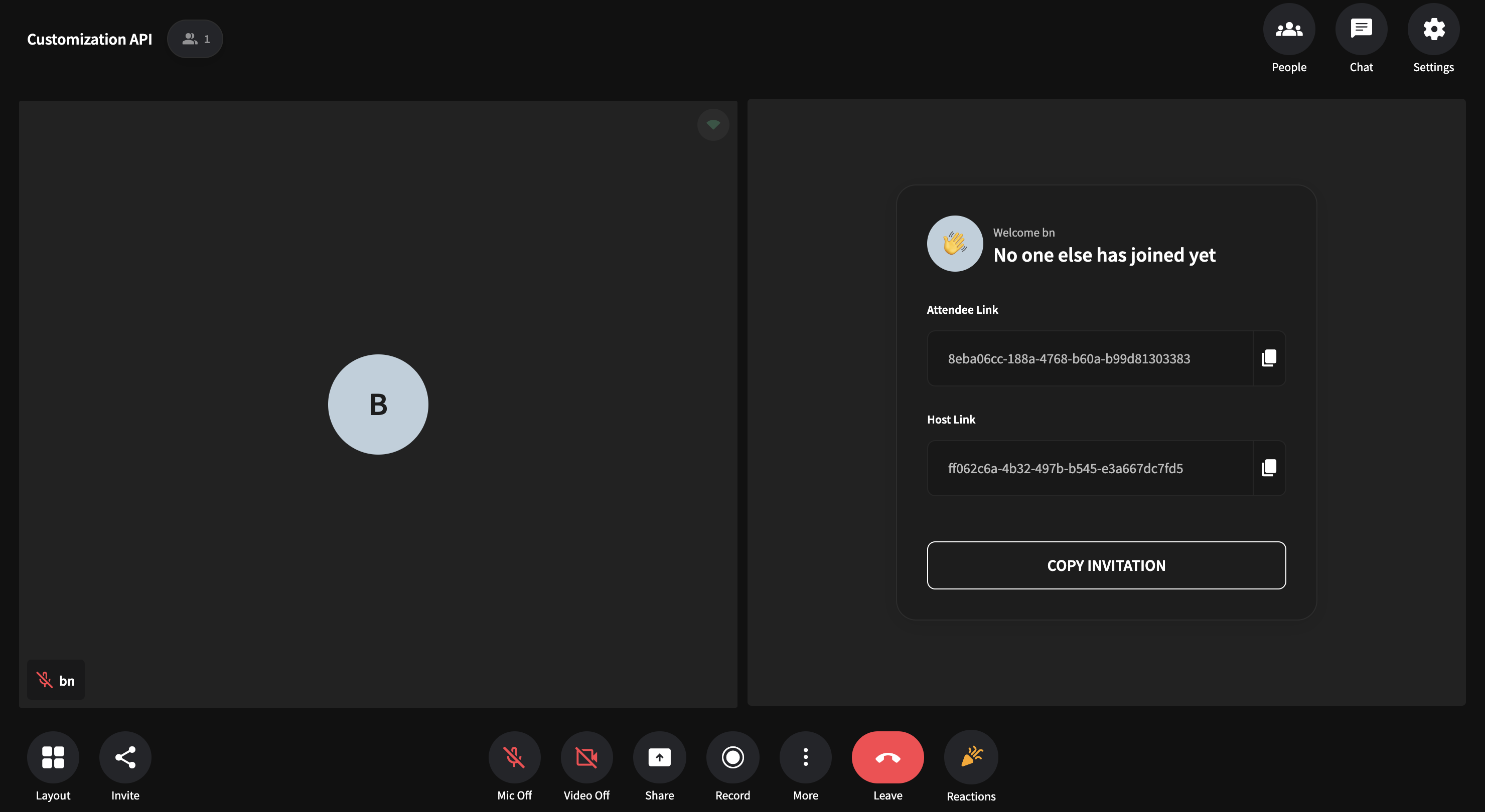
The VideoCall screen displays the active video call / livestream UI. This UI is shown when a user has joined a room.
Hence it is displayed after:
- The user clicks on
JoinButtoninside thePrecallscreen.
However if Precall Screen is disabled in the Builder,
The videoCall screen is directly displayed after:
- The user clicks on the “Start Meeting” button inside the
Sharescreen - The user clicks on a room invite link.
To make the customizations powerful, you can use the libraries to access the internal app state, send custom events, or re-use prebuilt subcomponents
Overrides:
VideoCallComponent : React.ComponentType
You can override the entire VideoCall screen by passing in a React.ComponentType under the videoCall key to the Components Api Object
Use the example code given below showcasing a simple use-case of the api as a guide.
- turnkey
- react-sdk
- web-sdk
import { customize } from "customization-api";
import React from "react";
import { View, Text, StyleSheet } from "react-native";

const VideoCallPage = () => {
  return (
    <View style={styles.container}>
      <View style={styles.textContainer}>
        <Text style={styles.textStyle}>
          Here is your new video call page. Use app-state and sub-components to
          customize your video call page
        </Text>
      </View>
    </View>
  );
};

const customization = customize({
  components: {
    videoCall: VideoCallPage,
  },
});

export default customization;

const styles = StyleSheet.create({
  container: {
    flex: 1,
    backgroundColor: "#90EE90",
    justifyContent: "center",
  },
  textContainer: {
    flex: 1,
    justifyContent: "center",
    alignSelf: "center",
    borderWidth: 1,
    maxHeight: 200,
    borderRadius: 30,
  },
  textStyle: {
    padding: 10,
    fontSize: 18,
    textAlign: "center",
    lineHeight: 30,
  },
});
import React, { useEffect } from "react";
import AppBuilderReactSdk from "@appbuilder/react";

const VideoCallPage = () => {
  return (
    <div style={styles.container}>
      <div style={styles.textContainer}>
        <div style={styles.textStyle}>
          Here is your new video call page. Use app-state and sub-components to
          customize your video call page.
        </div>
      </div>
    </div>
  );
};

function App() {
  useEffect(() => {
    AppBuilderReactSdk.customize({
      components: {
        videoCall: VideoCallPage,
      },
    });
  });

  return (
    <div style={{ display: "flex", flex: 1 }}>
      <AppBuilderReactSdk.View />
    </div>
  );
}

export default App;

const styles = {
  container: {
    flex: 1,
    backgroundColor: "#90EE90",
    justifyContent: "center",
    display: "flex",
  },
  textContainer: {
    display: "flex",
    height: "calc(100% - 2px)",
    justifyContent: "center",
    alignSelf: "center",
    border: "1px inset black",
    borderRadius: 30,
  },
  textStyle: {
    padding: "10px",
    fontSize: "20px",
    alignSelf: "center",
  },
};
<script type="module">
  import AppBuilderWebSdk from "@appbuilder/web";

  const VideoCallPage = () => {
    return (
      <div style={styles.container}>
        <div style={styles.textContainer}>
          <div style={styles.textStyle}>
            Here is your new video call page. Use app-state and sub-components
            to customize your video call page.
          </div>
        </div>
      </div>
    );
  };

  AppBuilderWebSdk.customize({
    components: {
      videoCall: VideoCallPage,
    },
  });

  const styles = {
    container: {
      flex: 1,
      backgroundColor: "#90EE90",
      justifyContent: "center",
      display: "flex",
    },
    textContainer: {
      display: "flex",
      height: "100%",
      justifyContent: "center",
      alignSelf: "center",
      border: "1px solid black",
      borderRadius: 30,
    },
    textStyle: {
      padding: "10px",
      fontSize: "20px",
      alignSelf: "center",
    },
  };
</script>

<div style="height: 100vh; width: 100vw; display: flex; flex: 1">
  <app-builder />
</div>
A more advanced usage example can be found here
You can override specific parts of the VideoCall screen by passing in this object with key and values corresponding to the part you want to override under the videoCall key to the Components Api Object
| Key | Type | Description |
|---|---|---|
| bottomToolBar? | BottomToolBarComponent | Customize the Bottom Bar by passing in your own component |
| topToolBar? | TopToolBarComponent | Customize the Top Bar by passing in your own component |
| chat? | ChatCmpInterface | Customize the entire chat panel or pass in an object to override a subcomponent |
| customLayout? | CustomLayoutOverrideFunction | Customize the available layouts or pass in your own layout. |
| participantsPanel? | ParticipantPanelComponent | Customize the Participants Panel by passing in your own component. |
The BottomToolBarComponent occupies the bottom part of the VideoCall screen and displays all the room controls.
The controls displayed change depending on the operating system/platform and the user config
Overrides:
BottomToolBarComponent : React.ComponentType
You can override the BottomBar component by passing in a React Component under the bottomToolBar key to the VideoCallInterface Object
AgoraAppBuilder.customize({
  components: {
    videoCall: {
      bottomToolBar: BottomToolBarOverride,
    },
  },
});
The overriden component can reuse existing bottom bar defaults or can be a complete new one.
Use the example code given below showcasing a simple use-case of the api as a guide.
- turnkey
- react-sdk
- web-sdk
import {
  customize,
  ToolbarPreset,
  ToolbarItem,
  IconButton,
} from "customization-api";
import React from "react";

const Reactions = () => {
  return (
    <ToolbarItem style={{ position: "relative" }}>
      <IconButton
        iconProps={{
          name: "celebration",
          iconSize: 28,
          tintColor: "orange",
        }}
        btnTextProps={{
          textColor: "white",
          text: "Reactions",
        }}
        onPress={() => {
          // handle onClick of new toolbar item
          console.warn("new toolbar item clicked");
        }}
      />
    </ToolbarItem>
  );
};

const BottomToolBarOverride = () => {
  return (
    <ToolbarPreset
      align="bottom"
      items={{
        reactions: {
          component: Reactions,
          order: 9, // position at which item should appear in bottom list
          align: "center", // can be start,center,end
          hide: false, // show icon or not
        },
      }}
      snapPointsMinMax={[100, 300]}
    />
  );
};

const customization = customize({
  components: {
    videoCall: {
      bottomToolBar: bottomToolBarOverride,
    },
  },
});

export default customization;
import AppBuilderReactSdk, {
  ToolbarPreset,
  ToolbarItem,
  IconButton,
} from "@appbuilder/react";

const Reactions = () => {
  return (
    <ToolbarItem>
      <IconButton
        iconProps={{
          name: "celebration",
          iconSize: 28,
          tintColor: "orange",
        }}
        btnTextProps={{
          textColor: "white",
          text: "Reactions",
        }}
        onPress={() => {
          // handle onClick of new toolbar item
          console.warn("new toolbar item clicked");
        }}
      />
    </ToolbarItem>
  );
};

const BottomToolBarOverride = () => {
  return (
    <ToolbarPreset
      align="bottom"
      items={{
        reactions: {
          component: Reactions,
          order: 9, // position at which item should appear in bottom list
          align: "center", // can be start,center,end
          hide: false, // show icon or not
        },
      }}
      snapPointsMinMax={[100, 300]}
    />
  );
};

function App() {
  React.useEffect(() => {
    AppBuilderReactSdk.customize({
      components: {
        videoCall: {
          bottomToolBar: BottomToolBarOverride,
        },
      },
    });
  });
}

export default App;
<script type="module">
  import AppBuilderWebSdk, {
    ToolbarPreset,
    ToolbarItem,
    IconButton,
  } from "@appbuilder/web";

  const Reactions = () => {
    return (
      <ToolbarItem style={{ position: "relative" }}>
        <IconButton
          iconProps={{
            name: "celebration",
            iconSize: 28,
            tintColor: "orange",
          }}
          btnTextProps={{
            textColor: "white",
            text: "Reactions",
          }}
          onPress={() => {
            // handle onClick of new toolbar item
            console.warn("new toolbar item clicked");
          }}
        />
      </ToolbarItem>
    );
  };

  const BottomToolBarOverride = () => {
    return (
      <ToolbarPreset
        align="bottom"
        items={{
          reactions: {
            component: Reactions,
            order: 9, // position at which item should appear in bottom list
            align: "center", // can be start,center,end
            hide: false, // show icon or not
          },
        }}
        snapPointsMinMax={[100, 300]}
      />
    );
  };

  AppBuilderWebSdk.customize({
    components: {
      videoCall: {
        bottomToolBar: BottomToolBarOverride,
      },
    },
  });
</script>

<div style="height: 100vh; width: 100vw; display: flex; flex: 1">
  <app-builder />
</div>
Result:
A more advanced usage example can be found here
The TopToolBarComponent occupies the top part of the VideoCall screen and displays the sidebar buttons along with room info.
The sidebar buttons displayed change depending on the user config
Overrides:
TopToolBarComponent : React.ComponentType
You can override the TopToolBar component by passing in a React Component under the topToolBar key to the VideoCallInterface Object
To reuse parts of default top bar ui you can import them from the Subcomponents Library accessible under the customization-api module.
Use the example code given below showcasing a simple use-case of the api as a guide.
- turnkey
- react-sdk
- web-sdk
import { customize } from "customization-api";
import React from "react";
import { View, Text, StyleSheet } from "react-native";

const TopToolBar = () => {
  return (
    <View style={styles.container}>
      <View style={styles.textContainer}>
        <Text style={styles.textStyle}>
          Here is your new top bar component. Use app-state and sub-components
          to customize your top bar
        </Text>
      </View>
    </View>
  );
};

const customization = customize({
  components: {
    videoCall: {
      topToolBar: TopToolBar,
    },
  },
});

export default customization;

const styles = StyleSheet.create({
  container: {
    flex: 1,
    backgroundColor: "#90EE90",
    justifyContent: "center",
  },
  textContainer: {
    flex: 1,
    justifyContent: "center",
    alignSelf: "center",
    borderWidth: 1,
    maxHeight: 200,
    borderRadius: 30,
  },
  textStyle: {
    padding: 10,
    fontSize: 18,
    textAlign: "center",
    lineHeight: 30,
  },
});
import React, { useEffect } from "react";
import AppBuilderReactSdk from "@appbuilder/react";

const TopToolBar = () => {
  return (
    <div style={styles.container}>
      <div style={styles.textContainer}>
        <div style={styles.textStyle}>
          Here is your new top bar component. Use app-state and sub-components
          to customize your top bar
        </div>
      </div>
    </div>
  );
};

function App() {
  useEffect(() => {
    AppBuilderReactSdk.customize({
      components: {
        videoCall: {
          topToolBar: TopToolBar,
        },
      },
    });
  });

  return (
    <div style={{ display: "flex", flex: 1 }}>
      <AppBuilderReactSdk.View />
    </div>
  );
}

export default App;

const styles = {
  container: {
    flex: 1,
    backgroundColor: "#90EE90",
    justifyContent: "center",
    display: "flex",
  },
  textContainer: {
    display: "flex",
    height: "100%",
    justifyContent: "center",
    alignSelf: "center",
    border: "1px solid black",
    borderRadius: 30,
  },
  textStyle: {
    padding: "10px",
    fontSize: "20px",
    alignSelf: "center",
  },
};
<script type="module">
  import AppBuilderWebSdk from "@appbuilder/web";

  const TopToolBar = () => {
    return (
      <div style={styles.container}>
        <div style={styles.textContainer}>
          <div style={styles.textStyle}>
            Here is your new top bar component. Use app-state and sub-components
            to customize your chat
          </div>
        </div>
      </div>
    );
  };

  AppBuilderWebSdk.customize({
    components: {
      videoCall: {
        topToolBar: TopToolBar,
      },
    },
  });

  const styles = {
    container: {
      flex: 1,
      backgroundColor: "#90EE90",
      justifyContent: "center",
      display: "flex",
    },
    textContainer: {
      display: "flex",
      height: "100%",
      justifyContent: "center",
      alignSelf: "center",
      border: "1px solid black",
      borderRadius: 30,
    },
    textStyle: {
      padding: "10px",
      fontSize: "20px",
      alignSelf: "center",
    },
  };
</script>

<div style="height: 100vh; width: 100vw; display: flex; flex: 1">
  <app-builder />
</div>
A more advanced usage example can be found here
The Chat component displays the ui to send and view the chat messages.
Overrides:
You can override the specific parts chat ui by passing in this object with key and values corresponding to the part you want to override under the chat key to the VideoCallInterface
| Method | Description |
|---|---|
| chat.chatBubble? | Customize the chat Bubble component. |
| chat.chatInput? | Customize the chat input and send button component. |
The ChatInput component displays the input box/send button used to enter/send message inside the chat ui.
Overrides :
chatInputComponent: React.ComponentType
You can override the ChatTextInput component by passing in a React Component under the chatInput key to the ChatCmpInterface Object
Use the code example given below showcasing overriding of the default chat input as a guide.
- turnkey
- react-sdk
- web-sdk
import { customize } from "customization-api";
import React from "react";
import { View, StyleSheet } from "react-native";

const ChatInput = () => {
  return <View style={styles.container}></View>;
};

const customization = customize({
  components: {
    videoCall: {
      chat: {
        chatInput: ChatInput,
      },
    },
  },
});

export default customization;

const styles = StyleSheet.create({
  container: {
    flex: 1,
    backgroundColor: "#90EE90",
    justifyContent: "center",
    height: 40,
    alignSelf: "center",
  },
});
import React, { useEffect } from "react";
import AppBuilderReactSdk from "@appbuilder/react";

const ChatInput = () => {
  return <div style={styles.container}></div>;
};

function App() {
  useEffect(() => {
    AppBuilderReactSdk.customize({
      components: {
        videoCall: {
          chat: {
            chatInput: ChatInput,
          },
        },
      },
    });
  });

  return (
    <div style={{ display: "flex", flex: 1 }}>
      <AppBuilderReactSdk.View />
    </div>
  );
}

export default App;

const styles = {
  container: {
    flex: 1,
    backgroundColor: "#90EE90",
    justifyContent: "center",
    alignSelf: "center",
    display: "flex",
    height: "40px",
  },
};
<script type="module">
  import AppBuilderWebSdk from "@appbuilder/web";

  const ChatInput = () => {
    return <div style={styles.container}></div>;
  };

  AppBuilderWebSdk.customize({
    components: {
      videoCall: {
        chat: {
          chatInput: ChatInput,
        },
      },
    },
  });

  const styles = {
    container: {
      flex: 1,
      backgroundColor: "#90EE90",
      justifyContent: "center",
      alignSelf: "center",
      display: "flex",
      height: "40px",
    },
  };
</script>

<div style="height: 100vh; width: 100vw; display: flex; flex: 1">
  <app-builder />
</div>
A more advanced usage example can be found here
The Chat Bubble component displays the message inside the chat ui. It is conditionally styled based on message origin (ie local or remote).
Overrides :
ChatBubbleComponent: React.ComponentType<ChatBubbleProps>
You can override the ChatBubble component by passing in a React Component under the chatBubble key to the ChatCmpInterface Object
ChatBubbleProps
| Prop | Type | Description |
|---|---|---|
| isLocal | boolean | Specifies if the message is from a local user or if it is from a remote user |
| message | string | Content of the chat message |
| createdTimestamp | number | Timestamp of the message creation |
| updatedTimestamp | number | Timestamp of the message updation |
| uid | UidType | Uid of the user who sent the message |
| msgId | string | Unique id for identify the message |
| isDeleted | boolean | Flag to confirm is the message is deleted |
| isSameUser | boolean | Flag to confirm is the message send by the local user |
| previousMessageCreatedTimestamp | string | Previous message(n-1) timestamp |
| render? | (isLocal: boolean, message: string, createdTimestamp: string,uid: UidType,msgId: string,isDeleted: boolean,updatedTimestamp: string,isSameUser: boolean, previousMessageCreatedTimestamp?: string,) => JSX.Element | Render method for chat bubble to provide a ui |
Use the code example given below showcasing overriding of the default chat bubble ui as a guide.
- turnkey
- react-sdk
- web-sdk
import { customize } from "customization-api";
import React from "react";
import { View, Text, StyleSheet } from "react-native";

const ChatBubble = () => {
  return (
    <View style={styles.container}>
      <View style={styles.textContainer}>
        <Text style={styles.textStyle}>
          Here is your new chat bubble component. Use app-state and
          sub-components to customize your chat
        </Text>
      </View>
    </View>
  );
};

const customization = customize({
  components: {
    videoCall: {
      chat: {
        chatBubble: ChatBubble,
      },
    },
  },
});

export default customization;

const styles = StyleSheet.create({
  container: {
    flex: 1,
    backgroundColor: "#90EE90",
    justifyContent: "center",
  },
  textContainer: {
    flex: 1,
    justifyContent: "center",
    alignSelf: "center",
    borderWidth: 1,
    maxHeight: 200,
    borderRadius: 30,
  },
  textStyle: {
    padding: 10,
    fontSize: 18,
    textAlign: "center",
    lineHeight: 30,
  },
});
import React, { useEffect } from "react";
import AppBuilderReactSdk from "@appbuilder/react";

const ChatBubble = () => {
  return (
    <div style={styles.container}>
      <div style={styles.textContainer}>
        <div style={styles.textStyle}>
          Here is your new chat bubble component. Use app-state and
          sub-components to customize your chat
        </div>
      </div>
    </div>
  );
};

function App() {
  useEffect(() => {
    AppBuilderReactSdk.customize({
      components: {
        videoCall: {
          chat: {
            chatBubble: ChatBubble,
          },
        },
      },
    });
  });

  return (
    <div style={{ display: "flex", flex: 1 }}>
      <AppBuilderReactSdk.View />
    </div>
  );
}

export default App;

const styles = {
  container: {
    flex: 1,
    backgroundColor: "#90EE90",
    justifyContent: "center",
    display: "flex",
  },
  textContainer: {
    display: "flex",
    height: "100%",
    justifyContent: "center",
    alignSelf: "center",
    border: "1px solid black",
    borderRadius: 30,
  },
  textStyle: {
    padding: "10px",
    fontSize: "20px",
    alignSelf: "center",
  },
};
<script type="module">
  import AppBuilderWebSdk from "@appbuilder/web";

  const ChatBubble = () => {
    return (
      <div style={styles.container}>
        <div style={styles.textContainer}>
          <div style={styles.textStyle}>
            Here is your new chat bubble component. Use app-state and
            sub-components to customize your chat
          </div>
        </div>
      </div>
    );
  };

  AppBuilderWebSdk.customize({
    components: {
      videoCall: {
        chat: {
          chatBubble: ChatBubble,
        },
      },
    },
  });

  const styles = {
    container: {
      flex: 1,
      backgroundColor: "#90EE90",
      justifyContent: "center",
      display: "flex",
    },
    textContainer: {
      display: "flex",
      height: "100%",
      justifyContent: "center",
      alignSelf: "center",
      border: "1px solid black",
      borderRadius: 30,
    },
    textStyle: {
      padding: "10px",
      fontSize: "20px",
      alignSelf: "center",
    },
  };
</script>

<div style="height: 100vh; width: 100vw; display: flex; flex: 1">
  <app-builder />
</div>
A more advanced usage example can be found here
The participantsPanel component lists all the users in the video call / livestream along with their audio and video status. Hosts additionally are able to see user controls such as mute participant , remove participant from call.
Overrides:
ParticipantsPanelComponent: React.ComponentType
You can override the entire participantsPanel component by passing in a React.ComponentType under the participanPanel key to the VideocallInterface Object
You can import parts of default participantsPanel ui from the Subcomponents Library accessible under the customization-api module to reuse them in your component.
Use the example code given below showcasing a simple use-case of the api as a guide.
- turnkey
- react-sdk
- web-sdk
import { customize } from "customization-api";
import React from "react";
import { View, Text, StyleSheet } from "react-native";

const ParticipantsPanel = () => {
  return (
    <View style={styles.container}>
      <View style={styles.textContainer}>
        <Text style={styles.textStyle}>
          Here is your new participants panel component. Use app-state and
          sub-components to customize your participants panel
        </Text>
      </View>
    </View>
  );
};

const customization = customize({
  components: {
    videoCall: {
      participantsPanel: ParticipantsPanel,
    },
  },
});

export default customization;

const styles = StyleSheet.create({
  container: {
    flex: 1,
    backgroundColor: "#90EE90",
    justifyContent: "center",
    width: "20%",
    minWidth: 200,
    maxWidth: 300,
  },
  textContainer: {
    flex: 1,
    justifyContent: "center",
    alignSelf: "center",
    borderWidth: 1,
    maxHeight: 200,
    borderRadius: 30,
  },
  textStyle: {
    padding: 10,
    fontSize: 18,
    textAlign: "center",
    lineHeight: 30,
  },
});
import React, { useEffect } from "react";
import AppBuilderReactSdk from "@appbuilder/react";

const ParticipantsPanel = () => {
  return (
    <div style={styles.container}>
      <div style={styles.textContainer}>
        <div style={styles.textStyle}>
          Here is your new participants panel component. Use app-state and
          sub-components to customize your participants panel
        </div>
      </div>
    </div>
  );
};

function App() {
  useEffect(() => {
    AppBuilderReactSdk.customize({
      components: {
        videoCall: {
          participantsPanel: ParticipantsPanel,
        },
      },
    });
  });

  return (
    <div style={{ display: "flex", flex: 1 }}>
      <AppBuilderReactSdk.View />
    </div>
  );
}

export default App;

const styles = {
  container: {
    flex: 1,
    backgroundColor: "#90EE90",
    justifyContent: "center",
    display: "flex",
  },
  textContainer: {
    display: "flex",
    height: "100%",
    justifyContent: "center",
    alignSelf: "center",
    border: "1px solid black",
    borderRadius: 30,
  },
  textStyle: {
    padding: "10px",
    fontSize: "20px",
    alignSelf: "center",
  },
};
<script type="module">
  import AppBuilderWebSdk from "@appbuilder/web";

  const ParticipantsPanel = () => {
    return (
      <div style={styles.container}>
        <div style={styles.textContainer}>
          <div style={styles.textStyle}>
            Here is your new participants panel component. Use app-state and
            sub-components to customize your chat
          </div>
        </div>
      </div>
    );
  };

  AppBuilderWebSdk.customize({
    components: {
      videoCall: {
        participantsPanel: ParticipantsPanel,
      },
    },
  });

  const styles = {
    container: {
      flex: 1,
      backgroundColor: "#90EE90",
      justifyContent: "center",
      display: "flex",
    },
    textContainer: {
      display: "flex",
      height: "100%",
      justifyContent: "center",
      alignSelf: "center",
      border: "1px solid black",
      borderRadius: 30,
    },
    textStyle: {
      padding: "10px",
      fontSize: "20px",
      alignSelf: "center",
    },
  };
</script>

<div style="height: 100vh; width: 100vw; display: flex; flex: 1">
  <app-builder />
</div>
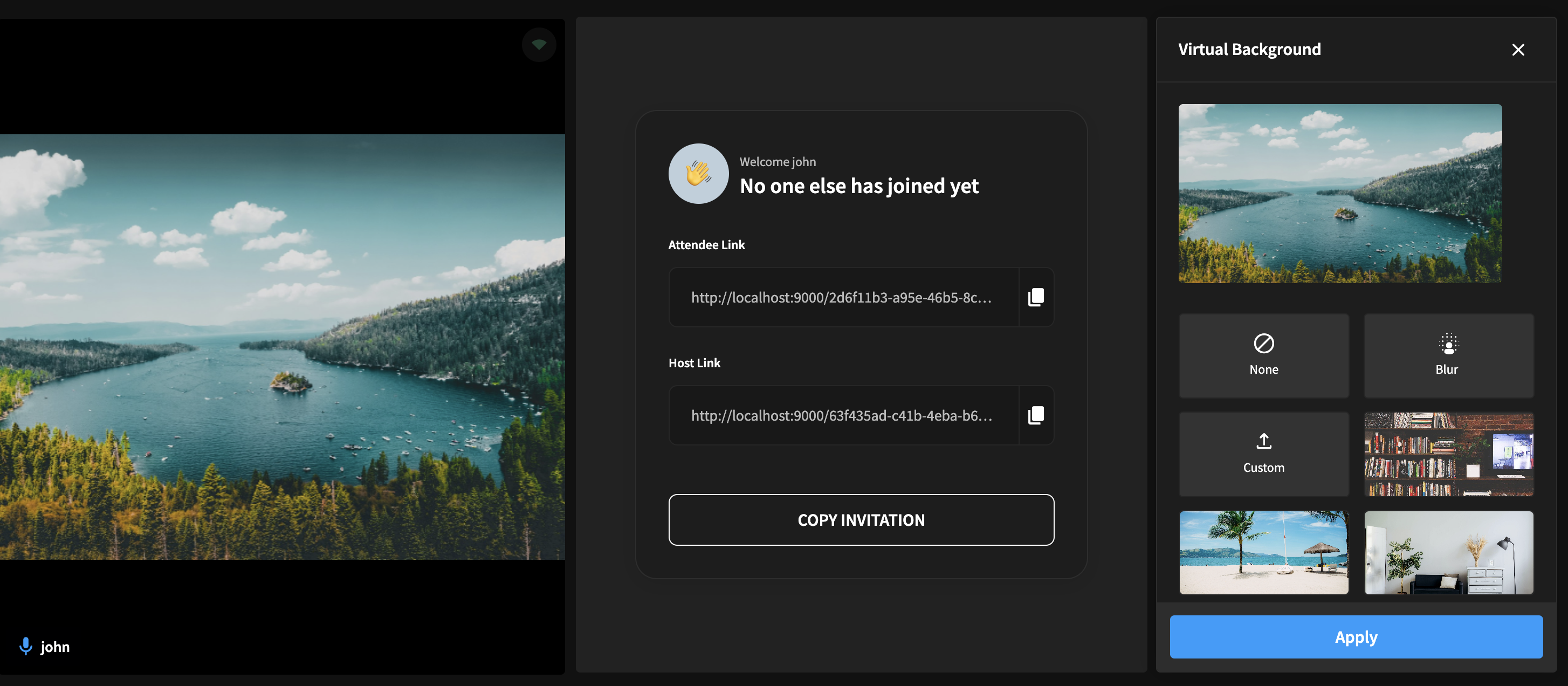
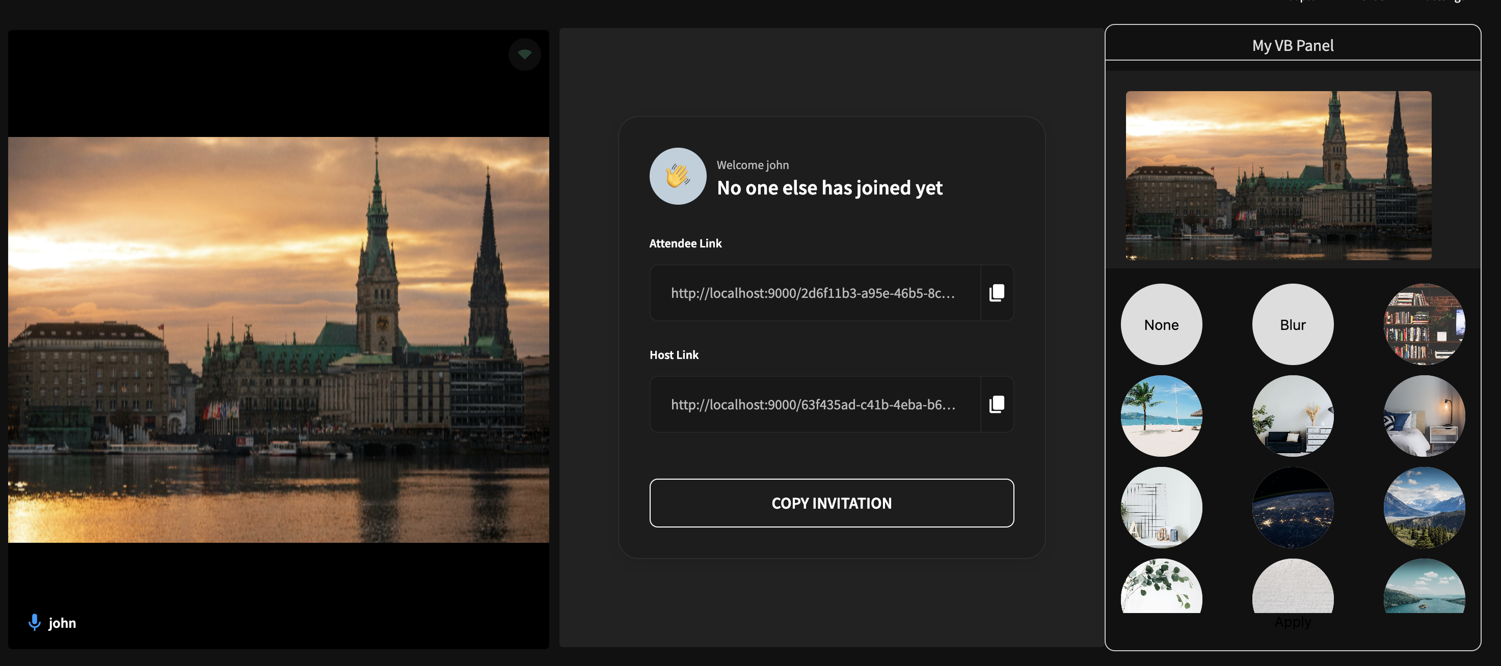
The virtualBackgroundPanel component offers a user-friendly interface for managing virtual backgrounds in a video call. It includes:
- List of Virtual Backgrounds: Displays all available virtual background options.
- Preview Area: Allows users to try out different virtual backgrounds.
- Save Button: Applies the selected virtual background effect to the ongoing video call.
Overrides:
VirtualBackgroundPanelComponent: React.ComponentType
You can override the entire virtualBackgroundPanel component by passing in a React.ComponentType under the virtualBackgroundPanel key to the VideocallInterface Object
Use the example code given below showcasing a simple use-case of the api as a guide.
- turnkey
- react-sdk
- web-sdk
import { customize } from "customization-api";
import React from "react";
import { View, Text, StyleSheet } from "react-native";

const VirtualBackgroundPanel = () => {
  return (
    <View style={styles.container}>
      <View style={styles.textContainer}>
        <Text style={styles.textStyle}>
          Here is your new virtual background panel component. Use app-state and
          sub-components to customize your virtualBackground panel
        </Text>
      </View>
    </View>
  );
};

const customization = customize({
  components: {
    videoCall: {
      virtualBackgroundPanel: VirtualBackgroundPanel,
    },
  },
});

export default customization;

const styles = StyleSheet.create({
  container: {
    flex: 1,
    backgroundColor: "#90EE90",
    justifyContent: "center",
    width: "20%",
    minWidth: 200,
    maxWidth: 300,
  },
  textContainer: {
    flex: 1,
    justifyContent: "center",
    alignSelf: "center",
    borderWidth: 1,
    maxHeight: 200,
    borderRadius: 30,
  },
  textStyle: {
    padding: 10,
    fontSize: 18,
    textAlign: "center",
    lineHeight: 30,
  },
});
import React, { useEffect } from "react";
import AppBuilderReactSdk from "@appbuilder/react";

const VirtualBackgroundPanel = () => {
  return (
    <div style={styles.container}>
      <div style={styles.textContainer}>
        <div style={styles.textStyle}>
          Here is your new virtualBackground panel component. Use app-state and
          sub-components to customize your virtualBackground panel
        </div>
      </div>
    </div>
  );
};

function App() {
  useEffect(() => {
    AppBuilderReactSdk.customize({
      components: {
        videoCall: {
          virtualBackgroundPanel: VirtualBackgroundPanel,
        },
      },
    });
  });

  return (
    <div style={{ display: "flex", flex: 1 }}>
      <AppBuilderReactSdk.View />
    </div>
  );
}

export default App;

const styles = {
  container: {
    flex: 1,
    backgroundColor: "#90EE90",
    justifyContent: "center",
    display: "flex",
  },
  textContainer: {
    display: "flex",
    height: "100%",
    justifyContent: "center",
    alignSelf: "center",
    border: "1px solid black",
    borderRadius: 30,
  },
  textStyle: {
    padding: "10px",
    fontSize: "20px",
    alignSelf: "center",
  },
};
<script type="module">
  import AppBuilderWebSdk from "@appbuilder/web";

  const VirtualBackgroundPanel = () => {
    return (
      <div style={styles.container}>
        <div style={styles.textContainer}>
          <div style={styles.textStyle}>
            Here is your new virtualBackground panel component. Use app-state
            and sub-components to customize your virtualBackground panel.
          </div>
        </div>
      </div>
    );
  };

  AppBuilderWebSdk.customize({
    components: {
      videoCall: {
        virtualBackgroundPanel: VirtualBackgroundPanel,
      },
    },
  });

  const styles = {
    container: {
      flex: 1,
      backgroundColor: "#90EE90",
      justifyContent: "center",
      display: "flex",
    },
    textContainer: {
      display: "flex",
      height: "100%",
      justifyContent: "center",
      alignSelf: "center",
      border: "1px solid black",
      borderRadius: 30,
    },
    textStyle: {
      padding: "10px",
      fontSize: "20px",
      alignSelf: "center",
    },
  };
</script>

<div style="height: 100vh; width: 100vw; display: flex; flex: 1">
  <app-builder />
</div>
Result:
A more advanced usage example can be found here
Customize the layout through LayoutInterface
Overrides:
customLayoutOverrideFunction: ( DefaultLayouts ) => LayoutItem[]
You can override the layouts by providing a function with LayoutInterface[] return type to the customLayout under VideoCallInterface object.
This function receives an array of default layouts and expects you to return an array of LayoutObjects that represent your layouts.
DefaultLayouts: Array <LayoutInterface>
| Index | Type | Value |
|---|---|---|
| 0 | LayoutInterface | { name: 'pinned', icon: <"PinnedIcon">, component: PinnedLayoutComponent } |
| 1 | LayoutInterface | { name: 'grid', icon: <"GridIcon">, component: GridLayoutComponent } |
LayoutItem
| Key | Type | Description |
|---|---|---|
| name | string | Name of the layout |
| label | string | Label of the layout to be displayed in UI |
| icon | string | Can be a 1. Base 64 Image string 2. CDN URL 3. Bundler imported string |
| component | LayoutComponent | Layout component to be used to render the video feeds |
LayoutComponent: React.Component<{ renderData: contentStateInterface["activeUids"] }>
Use the example code given below showcasing appending a custom layout as a guide.
- turnkey
- react-sdk
- web-sdk
import { customize } from "customization-api";
import React from "react";
import { View, Text, StyleSheet } from "react-native";

const CustomLayout = () => {
  return (
    <View style={styles.container}>
      <View style={styles.textContainer}>
        <Text style={styles.textStyle}>
          Here is your new custom layout view. Use app-state and sub-components
          to customize your layout
        </Text>
      </View>
    </View>
  );
};

const customization = customize({
  components: {
    videoCall: {
      customLayout: (defaultLayouts) => [
        ...defaultLayouts,
        {
          component: CustomLayout,
          label: "Custom Layout",
          name: "CustomLayout",
          icon: <"base64 string">,
        },
      ],
    },
  },
});

export default customization;

const styles = StyleSheet.create({
  container: {
    flex: 1,
    backgroundColor: "#90EE90",
    justifyContent: "center",
  },
  textContainer: {
    flex: 1,
    justifyContent: "center",
    alignSelf: "center",
    borderWidth: 1,
    maxHeight: 200,
    borderRadius: 30,
  },
  textStyle: {
    padding: 10,
    fontSize: 18,
    textAlign: "center",
    lineHeight: 30,
  },
});
import React, { useEffect } from "react";
import AppBuilderReactSdk from "@appbuilder/react";

const CustomLayout = () => {
  return (
    <div style={styles.container}>
      <div style={styles.textContainer}>
        <div style={styles.textStyle}>
          Here is your new custom layout view. Use app-state and sub-components
          to customize your layout
        </div>
      </div>
    </div>
  );
};

function App() {
  useEffect(() => {
    AppBuilderReactSdk.customize({
      components: {
        videoCall: {
          customLayout: (defaultLayouts) => [
            ...defaultLayouts,
            {
              component: CustomLayout,
              label: "Custom Layout",
              name: "CustomLayout",
              icon: <"base64 string">,
            },
          ],
        },
      },
    });
  });

  return (
    <div style={{ display: "flex", flex: 1 }}>
      <AppBuilderReactSdk.View />
    </div>
  );
}

export default App;

const styles = {
  container: {
    flex: 1,
    backgroundColor: "#90EE90",
    justifyContent: "center",
    display: "flex",
  },
  textContainer: {
    display: "flex",
    height: "100%",
    justifyContent: "center",
    alignSelf: "center",
    border: "1px solid black",
    borderRadius: 30,
  },
  textStyle: {
    padding: "10px",
    fontSize: "20px",
    alignSelf: "center",
  },
};
<script type="module">
  import AppBuilderWebSdk, { React } from "@appbuilder/web";
  const { useContext, useEffect, useState } = React;

  const CustomLayout = () => {
    return (
      <div style={styles.container}>
        <div style={styles.textContainer}>
          <div style={styles.textStyle}>
            Here is your new custom layout view. Use app-state and
            sub-components to customize your layout
          </div>
        </div>
      </div>
    );
  };

  AppBuilderWebSdk.customize({
    components: {
      videoCall: {
        customLayout: (defaultLayouts) => [
          ...defaultLayouts,
          {
            component: CustomLayout,
            label: "Custom Layout",
            name: "CustomLayout",
            icon: <"base64 string">,
          },
        ],
      },
    },
  });

  const styles = {
    container: {
      flex: 1,
      backgroundColor: "#90EE90",
      justifyContent: "center",
      display: "flex",
    },
    textContainer: {
      display: "flex",
      height: "100%",
      justifyContent: "center",
      alignSelf: "center",
      border: "1px solid black",
      borderRadius: 30,
    },
    textStyle: {
      padding: "10px",
      fontSize: "20px",
      alignSelf: "center",
    },
  };
</script>

<div style="height: 100vh; width: 100vw; display: flex; flex: 1">
  <app-builder />
</div>
A more advanced usage example can be found here
Accepts a React Component under which the Video UI is rendered.
The component must return the received props.children to render the Video call
videoCall.wrapper does have access to any App Builder app states
Use the example code given below showcasing a simple use-case of the api as a guide.
- turnkey
- react-sdk
- web-sdk
import { customize, useRecording, useRoomInfo } from "customization-api";
import React, { useContext, useEffect, useState } from "react";
import { View, Text, StyleSheet } from "react-native";

export interface WrapperInterface {
  customKey1?: string;
  customKey2?: string;
}

const WrapperContext = React.createContext<WrapperInterface>({
  customKey1: "default value 1",
  customKey2: "default value 2",
});

interface WrapperProviderProps {
  children: React.ReactNode;
}

const WrapperProvider = (props: WrapperProviderProps) => {
  const [customState, setCustomState] = useState<WrapperInterface>({});
  const { startRecording } = useRecording();
  const { data } = useRoomInfo();

  useEffect(() => {
    if (data?.isHost) {
      //start recording automatically if he is the host
      startRecording();
    }

    //set custom data to access inside the other UI override in the video call screen
    setCustomState({
      customKey1: "custom value 1",
      customKey2: "custom value 2",
    });
  }, [data]);
  return (
    <WrapperContext.Provider value={{ ...customState }}>
      {props.children}
    </WrapperContext.Provider>
  );
};

const styles = StyleSheet.create({
  container: {
    flex: 1,
    backgroundColor: "#90EE90",
    justifyContent: "center",
  },
});

const customization = customize({
  components: {
    videoCall: {
      wrapper: WrapperProvider,
    },
  },
});

export default customization;
import AppBuilderReactSdk, {
  useRecording,
  useRoomInfo,
} from "@appbuilder/react";
import React, { useContext, useEffect, useState } from "react";

export interface WrapperInterface {
  customKey1?: string;
  customKey2?: string;
}

const WrapperContext = React.createContext<WrapperInterface>({
  customKey1: "default value 1",
  customKey2: "default value 2",
});

interface WrapperProviderProps {
  children: React.ReactNode;
}

const WrapperProvider = (props: WrapperProviderProps) => {
  const [customState, setCustomState] = useState<WrapperInterface>({});
  const { startRecording } = useRecording();
  const { data } = useRoomInfo();

  useEffect(() => {
    if (data?.isHost) {
      //start recording automatically if he is the host
      startRecording();
    }

    //set custom data to access inside the other UI override in the video call screen
    setCustomState({
      customKey1: "custom value 1",
      customKey2: "custom value 2",
    });
  }, [data]);
  return (
    <WrapperContext.Provider value={{ ...customState }}>
      {props.children}
    </WrapperContext.Provider>
  );
};

const styles = StyleSheet.create({
  container: {
    flex: 1,
    backgroundColor: "#90EE90",
    justifyContent: "center",
  },
});

function App() {
  useEffect(() => {
    AppBuilderReactSdk.customize({
      components: {
        videoCall: {
          wrapper: WrapperProvider,
        },
      },
    });
  });

  return (
    <div style={{ display: "flex", flex: 1 }}>
      <AppBuilderReactSdk.View />
    </div>
  );
}

const styles = {
  container: {
    flex: 1,
    backgroundColor: "#90EE90",
    justifyContent: "center",
    display: "flex",
  },
};

export default App;
<script type="module">
  import AppBuilderWebSdk, {
    React,
    useRecording,
    useRoomInfo,
  } from "@appbuilder/web";
  const { useContext, useEffect, useState, createContext } = React;

  const WrapperContext = React.createContext({
    customKey1: "default value 1",
    customKey2: "default value 2",
  });

  const WrapperProvider = (props) => {
    const [customState, setCustomState] = useState({});
    const { startRecording } = useRecording();
    const { data } = useRoomInfo();

    useEffect(() => {
      if (data?.isHost) {
        //start recording automatically if he is the host
        startRecording();
      }

      //set custom data to access inside the other UI override in the video call screen
      setCustomState({
        customKey1: "custom value 1",
        customKey2: "custom value 2",
      });
    }, [data]);
    return (
      <WrapperContext.Provider value={{ ...customState }}>
        {props.children}
      </WrapperContext.Provider>
    );
  };

  const styles = StyleSheet.create({
    container: {
      flex: 1,
      backgroundColor: "#90EE90",
      justifyContent: "center",
    },
  });

  AppBuilderWebSdk.customize({
    components: {
      videoCall: {
        wrapper: WrapperProvider,
      },
    },
  });

  const styles = {
    container: {
      flex: 1,
      backgroundColor: "#90EE90",
      justifyContent: "center",
      display: "flex",
    },
  };
</script>

<div style="height: 100vh; width: 100vw; display: flex; flex: 1">
  <app-builder />
</div>
The captionPanel component contains live caption data for last two speakers. This live caption data will be updated based on any correction or improvement needed
Overrides:
CaptionPanelComponent: React.ComponentType
You can override the entire captionPanel component by passing in a React.ComponentType under the captionPanel key to the VideocallInterface Object
You can import parts of default captionPanel ui from the SubComponents Library accessible under the customization-api module to reuse them in your component.
Use the example code given below showcasing a simple use-case of the api as a guide.
- turnkey
- react-sdk
- web-sdk
import { customize } from "customization-api";
import React from "react";
import { View, Text, StyleSheet } from "react-native";

const CaptionPanel = () => {
  return (
    <View style={styles.container}>
      <View style={styles.textContainer}>
        <Text style={styles.textStyle}>
          Here is your new caption panel component. Use app-state and
          sub-components to customize your caption panel
        </Text>
      </View>
    </View>
  );
};

const customization = customize({
  components: {
    videoCall: {
      captionPanel: CaptionPanel,
    },
  },
});

export default customization;

const styles = StyleSheet.create({
  container: {
    flex: 1,
    backgroundColor: "#90EE90",
    justifyContent: "center",
    width: "20%",
    minWidth: 200,
    maxWidth: 300,
  },
  textContainer: {
    flex: 1,
    justifyContent: "center",
    alignSelf: "center",
    borderWidth: 1,
    maxHeight: 200,
    borderRadius: 30,
  },
  textStyle: {
    padding: 10,
    fontSize: 18,
    textAlign: "center",
    lineHeight: 30,
  },
});
import React, { useEffect } from "react";
import AppBuilderReactSdk from "@appbuilder/react";

const CaptionPanel = () => {
  return (
    <div style={styles.container}>
      <div style={styles.textContainer}>
        <div style={styles.textStyle}>
          Here is your new caption panel component. Use app-state and
          sub-components to customize your caption panel
        </div>
      </div>
    </div>
  );
};

function App() {
  useEffect(() => {
    AppBuilderReactSdk.customize({
      components: {
        videoCall: {
          captionPanel: CaptionPanel,
        },
      },
    });
  });

  return (
    <div style={{ display: "flex", flex: 1 }}>
      <AppBuilderReactSdk.View />
    </div>
  );
}

export default App;

const styles = {
  container: {
    flex: 1,
    backgroundColor: "#90EE90",
    justifyContent: "center",
    display: "flex",
  },
  textContainer: {
    display: "flex",
    height: "100%",
    justifyContent: "center",
    alignSelf: "center",
    border: "1px solid black",
    borderRadius: 30,
  },
  textStyle: {
    padding: "10px",
    fontSize: "20px",
    alignSelf: "center",
  },
};
<script type="module">
  import AppBuilderWebSdk from "@appbuilder/web";

  const CaptionPanel = () => {
    return (
      <div style={styles.container}>
        <div style={styles.textContainer}>
          <div style={styles.textStyle}>
            Here is your new caption panel component. Use app-state and
            sub-components to customize your caption panel
          </div>
        </div>
      </div>
    );
  };

  AppBuilderWebSdk.customize({
    components: {
      videoCall: {
        captionPanel: CaptionPanel,
      },
    },
  });

  const styles = {
    container: {
      flex: 1,
      backgroundColor: "#90EE90",
      justifyContent: "center",
      display: "flex",
    },
    textContainer: {
      display: "flex",
      height: "100%",
      justifyContent: "center",
      alignSelf: "center",
      border: "1px solid black",
      borderRadius: 30,
    },
    textStyle: {
      padding: "10px",
      fontSize: "20px",
      alignSelf: "center",
    },
  };
</script>

<div style="height: 100vh; width: 100vw; display: flex; flex: 1">
  <app-builder />
</div>
The transcriptPanel component contains finalized transcript data for all users who spoken during the session and user will have option to download the transcript data
Overrides:
TranscriptPanelComponent: React.ComponentType
You can override the entire transcriptPanel component by passing in a React.ComponentType under the transcriptPanel key to the VideocallInterface Object
You can import parts of default transcriptPanel ui from the SubComponents Library accessible under the customization-api module to reuse them in your component.
Use the example code given below showcasing a simple use-case of the api as a guide.
- turnkey
- react-sdk
- web-sdk
import { customize } from "customization-api";
import React from "react";
import { View, Text, StyleSheet } from "react-native";

const TranscriptPanel = () => {
  return (
    <View style={styles.container}>
      <View style={styles.textContainer}>
        <Text style={styles.textStyle}>
          Here is your new transcript panel component. Use app-state and
          sub-components to customize your transcript panel
        </Text>
      </View>
    </View>
  );
};

const customization = customize({
  components: {
    videoCall: {
      transcriptPanel: TranscriptPanel,
    },
  },
});

export default customization;

const styles = StyleSheet.create({
  container: {
    flex: 1,
    backgroundColor: "#90EE90",
    justifyContent: "center",
    width: "20%",
    minWidth: 200,
    maxWidth: 300,
  },
  textContainer: {
    flex: 1,
    justifyContent: "center",
    alignSelf: "center",
    borderWidth: 1,
    maxHeight: 200,
    borderRadius: 30,
  },
  textStyle: {
    padding: 10,
    fontSize: 18,
    textAlign: "center",
    lineHeight: 30,
  },
});
import React, { useEffect } from "react";
import AppBuilderReactSdk from "@appbuilder/react";

const TranscriptPanel = () => {
  return (
    <div style={styles.container}>
      <div style={styles.textContainer}>
        <div style={styles.textStyle}>
          Here is your new transcript panel component. Use app-state and
          sub-components to customize your transcript panel
        </div>
      </div>
    </div>
  );
};

function App() {
  useEffect(() => {
    AppBuilderReactSdk.customize({
      components: {
        videoCall: {
          transcriptPanel: TranscriptPanel,
        },
      },
    });
  });

  return (
    <div style={{ display: "flex", flex: 1 }}>
      <AppBuilderReactSdk.View />
    </div>
  );
}

export default App;

const styles = {
  container: {
    flex: 1,
    backgroundColor: "#90EE90",
    justifyContent: "center",
    display: "flex",
  },
  textContainer: {
    display: "flex",
    height: "100%",
    justifyContent: "center",
    alignSelf: "center",
    border: "1px solid black",
    borderRadius: 30,
  },
  textStyle: {
    padding: "10px",
    fontSize: "20px",
    alignSelf: "center",
  },
};
<script type="module">
  import AppBuilderWebSdk from "@appbuilder/web";

  const TranscriptPanel = () => {
    return (
      <div style={styles.container}>
        <div style={styles.textContainer}>
          <div style={styles.textStyle}>
            Here is your new transcript panel component. Use app-state and
            sub-components to customize your transcript panel
          </div>
        </div>
      </div>
    );
  };

  AppBuilderWebSdk.customize({
    components: {
      videoCall: {
        transcriptPanel: TranscriptPanel,
      },
    },
  });

  const styles = {
    container: {
      flex: 1,
      backgroundColor: "#90EE90",
      justifyContent: "center",
      display: "flex",
    },
    textContainer: {
      display: "flex",
      height: "100%",
      justifyContent: "center",
      alignSelf: "center",
      border: "1px solid black",
      borderRadius: 30,
    },
    textStyle: {
      padding: "10px",
      fontSize: "20px",
      alignSelf: "center",
    },
  };
</script>

<div style="height: 100vh; width: 100vw; display: flex; flex: 1">
  <app-builder />
</div>
The customSidePanel API used to inject custom side panel into the video call screen. To activate the custom side panel use useSidePanel
Overrides:
customSidePanelOverrideFunction: () => SidePanelItem[]
You can pass function which return array of objects, Object will contain information to inject custom side panel
SidePanelItem
| Key | Type | Description |
|---|---|---|
| name | string | Unique name of the sidepanel which used to activate side panel |
| title | string | Label of the sidepanel to be displayed in UI |
| component | React.Component | React component used to render in the side panel |
| onClose | () => void | Callback function which will be executed on closing the side panel |
Use the example code given below showcasing a simple use-case of the api as a guide.
- turnkey
- react-sdk
- web-sdk
import { customize } from "customization-api";
import React from "react";
import { View, Text, StyleSheet } from "react-native";

const CustomSidePanel = () => {
  return (
    <View style={styles.container}>
      <View style={styles.textContainer}>
        <Text style={styles.textStyle}>
          Here is your new custom side panel component. Use app-state and
          sub-components to customize your custom side panel
        </Text>
      </View>
    </View>
  );
};

const customization = customize({
  components: {
    videoCall: {
      customSidePanel: () => {
        return [
          {
            name: "custom-side-panel-1",
            component: CustomSidePanel,
            title: "Custom Side Panel - One",
            onClose: () => {},
          },
        ];
      },
    },
  },
});

export default customization;

const styles = StyleSheet.create({
  container: {
    flex: 1,
    backgroundColor: "#90EE90",
    justifyContent: "center",
  },
  textContainer: {
    flex: 1,
    justifyContent: "center",
    alignSelf: "center",
    borderWidth: 1,
    maxHeight: 200,
    borderRadius: 30,
  },
  textStyle: {
    padding: 10,
    fontSize: 18,
    textAlign: "center",
    lineHeight: 30,
  },
});
import React, { useEffect } from "react";
import AppBuilderReactSdk from "@appbuilder/react";

const CustomSidePanel = () => {
  return (
    <div style={styles.container}>
      <div style={styles.textContainer}>
        <div style={styles.textStyle}>
          Here is your new custom side panel component. Use app-state and
          sub-components to customize your custom side panel
        </div>
      </div>
    </div>
  );
};

function App() {
  useEffect(() => {
    AppBuilderReactSdk.customize({
      components: {
        videoCall: {
          customSidePanel: () => {
            return [
              {
                name: "custom-side-panel-1",
                component: CustomSidePanel,
                title: "Custom Side Panel - One",
                onClose: () => {},
              },
            ];
          },
        },
      },
    });
  });

  return (
    <div style={{ display: "flex", flex: 1 }}>
      <AppBuilderReactSdk.View />
    </div>
  );
}

export default App;

const styles = {
  container: {
    flex: 1,
    backgroundColor: "#90EE90",
    justifyContent: "center",
    display: "flex",
  },
  textContainer: {
    display: "flex",
    height: "100%",
    justifyContent: "center",
    alignSelf: "center",
    border: "1px solid black",
    borderRadius: 30,
  },
  textStyle: {
    padding: "10px",
    fontSize: "20px",
    alignSelf: "center",
  },
};
<script type="module">
  import AppBuilderWebSdk from "@appbuilder/web";

  const CustomSidePanel = () => {
    return (
      <div style={styles.container}>
        <div style={styles.textContainer}>
          <div style={styles.textStyle}>
            Here is your new custom side panel component. Use app-state and
            sub-components to customize your custom side panel
          </div>
        </div>
      </div>
    );
  };

  AppBuilderWebSdk.customize({
    components: {
      videoCall: {
        customSidePanel: () => {
          return [
            {
              name: "custom-side-panel-1",
              component: CustomSidePanel,
              title: "Custom Side Panel - One",
              onClose: () => {},
            },
          ];
        },
      },
    },
  });

  const styles = {
    container: {
      flex: 1,
      backgroundColor: "#90EE90",
      justifyContent: "center",
      display: "flex",
    },
    textContainer: {
      display: "flex",
      height: "100%",
      justifyContent: "center",
      alignSelf: "center",
      border: "1px solid black",
      borderRadius: 30,
    },
    textStyle: {
      padding: "10px",
      fontSize: "20px",
      alignSelf: "center",
    },
  };
</script>

<div style="height: 100vh; width: 100vw; display: flex; flex: 1">
  <app-builder />
</div>
The customAgentInterface API used to modify AI Agent Interface. To get AI Agent State use useAIAgent
Overrides:
| Key | Type | Description |
|---|---|---|
| connectionState | aiagentstate | It is used to identiy the AI agent connection state |
Use the example code given below showcasing a simple use-case of the api as a guide.
- turnkey
- react-sdk
- web-sdk
import React, { useEffect } from "react";
import { CustomAgentInterfaceProps, customize } from "customization-api";
import { View, StyleSheet } from "react-native";
//install this package
const { Application } = require("@splinetool/runtime");

const AiAgentCustomView = ({ connectionState }: CustomAgentInterfaceProps) => {
  useEffect(() => {
    setTimeout(() => {
      // make sure you have a canvas in the body
      const canvas = document.getElementById("ai-agent") as HTMLCanvasElement;
      // start the application and load the scene
      const spline = new Application(canvas);
      spline.load(
        "https://d1i64xs2div6cu.cloudfront.net/scene-250216.splinecode",
      );
    });
  }, []);
  return (
    <View style={styles.container}>
      <canvas id="ai-agent" width="100%" height="100%"></canvas>
    </View>
  );
};

const customization = customize({
  components: {
    videoCall: {
      customAgentInterface: AiAgentCustomView,
    },
  },
});

export default customization;

const styles = StyleSheet.create({
  container: {
    flex: 1,
    backgroundColor: $config.VIDEO_AUDIO_TILE_COLOR,
    display: "flex",
    alignItems: "center",
    justifyContent: "center",
  },
});
import React, { useEffect } from "react";
import AppBuilderReactSdk from "@appbuilder/react";
import { CustomAgentInterfaceProps, customize } from "customization-api";
//install this package
const { Application } = require("@splinetool/runtime");

const AiAgentCustomView = ({ connectionState }: CustomAgentInterfaceProps) => {
  useEffect(() => {
    setTimeout(() => {
      // make sure you have a canvas in the body
      const canvas = document.getElementById("ai-agent") as HTMLCanvasElement;
      // start the application and load the scene
      const spline = new Application(canvas);
      spline.load(
        "https://d1i64xs2div6cu.cloudfront.net/scene-250216.splinecode",
      );
    });
  }, []);
  return (
    <div style={styles.container}>
      <canvas id="ai-agent" width="100%" height="100%"></canvas>
    </div>
  );
};

function App() {
  useEffect(() => {
    AppBuilderReactSdk.customize({
      components: {
        videoCall: {
          customAgentInterface: AiAgentCustomView,
        },
      },
    });
  });

  return (
    <div style={{ display: "flex", flex: 1 }}>
      <AppBuilderReactSdk.View />
    </div>
  );
}

export default App;

const styles = {
  flex: 1,
  backgroundColor: $config.VIDEO_AUDIO_TILE_COLOR,
  display: "flex",
  alignItems: "center",
  justifyContent: "center",
};
<script type="module">
  import AppBuilderWebSdk,{ React, CustomAgentInterfaceProps } from "@appbuilder/web";
  const { useEffect } = React
  //install this package
  const { Application } = require("@splinetool/runtime");


  const AiAgentCustomView = ({ connectionState }: CustomAgentInterfaceProps) => {
    useEffect(() => {
      setTimeout(() => {
        // make sure you have a canvas in the body
        const canvas = document.getElementById("ai-agent") as HTMLCanvasElement;
        // start the application and load the scene
        const spline = new Application(canvas);
        spline.load(
          "https://d1i64xs2div6cu.cloudfront.net/scene-250216.splinecode",
        );
      });
    }, []);
    return (
      <div style={styles.container}>
        <canvas id="ai-agent" width="100%" height="100%"></canvas>
      </div>
    );
  };

  AppBuilderWebSdk.customize({
    components: {
      videoCall: {
        customAgentInterface: AiAgentCustomView,
      },
    },
  });

  const styles = {
    flex: 1,
    backgroundColor: $config.VIDEO_AUDIO_TILE_COLOR,
    display: "flex",
    alignItems: "center",
    justifyContent: "center",
  };
</script>

<div style="height: 100vh; width: 100vw; display: flex; flex: 1">
  <app-builder />
</div>
Accepts a React Component under which the App Builder ui is rendered.
The component must return the received props.children to render the App Builder ui.
App root does not have access to any App Builder app states
Use the example code given below showcasing a simple use-case of the api as a guide.
- turnkey
- react-sdk
- web-sdk
import { customize } from "customization-api";
import React, { useContext, useEffect, useState } from "react";
import { View, Text, StyleSheet } from "react-native";

export interface AppRootInterface {
  customKey1?: string;
  customKey2?: string;
}

const AppRootContext = React.createContext<AppRootInterface>({
  customKey1: "default value 1",
  customKey2: "default value 2",
});

interface AppRootProviderProps {
  children: React.ReactNode;
}

const AppRootProvider = (props: AppRootProviderProps) => {
  const [customState, setCustomState] = useState<AppRootInterface>({});
  useEffect(() => {
    setCustomState({
      customKey1: "custom value 1",
      customKey2: "custom value 2",
    });
  }, []);
  return (
    <AppRootContext.Provider value={{ ...customState }}>
      {props.children}
    </AppRootContext.Provider>
  );
};

const VideoCallPage = () => {
  const { customKey1, customKey2 } = useContext(AppRootContext);
  return (
    <View style={styles.container}>
      <View style={styles.textContainer}>
        <Text style={[styles.textStyle, { fontWeight: "bold" }]}>
          Custom key 1 - {customKey1} {"\n"}
          Custom key 2 - {customKey2} {"\n"}
        </Text>
        <Text style={styles.textStyle}>
          Here is your app root sample usage.
        </Text>
      </View>
    </View>
  );
};
const styles = StyleSheet.create({
  container: {
    flex: 1,
    backgroundColor: "#90EE90",
    justifyContent: "center",
  },
  textContainer: {
    flex: 1,
    justifyContent: "center",
    alignSelf: "center",
    borderWidth: 1,
    maxHeight: 200,
    borderRadius: 30,
  },
  textStyle: {
    padding: 10,
    fontSize: 18,
    textAlign: "center",
    lineHeight: 30,
  },
});

const customization = customize({
  components: {
    appRoot: AppRootProvider,
    videoCall: VideoCallPage,
  },
});

export default customization;
import AppBuilderReactSdk from "@appbuilder/react";
import React, { useContext, useEffect, useState } from "react";

export interface AppRootInterface {
  customKey1?: string;
  customKey2?: string;
}

const AppRootContext = React.createContext<AppRootInterface>({
  customKey1: "default value 1",
  customKey2: "default value 2",
});

interface AppRootProviderProps {
  children: React.ReactNode;
}

const AppRootProvider = (props: AppRootProviderProps) => {
  const [customState, setCustomState] = useState<AppRootInterface>({});
  useEffect(() => {
    setCustomState({
      customKey1: "custom value 1",
      customKey2: "custom value 2",
    });
  }, []);
  return (
    <AppRootContext.Provider value={{ ...customState }}>
      {props.children}
    </AppRootContext.Provider>
  );
};

const VideoCallPage = () => {
  const { customKey1, customKey2 } = useContext(AppRootContext);
  return (
    <div style={styles.container}>
      <div style={styles.textContainer}>
        <div style={{ ...styles.textStyle, ...{ fontWeight: "bold" } }}>
          Custom key 1 - {customKey1}
        </div>
        <div style={{ ...styles.textStyle, ...{ fontWeight: "bold" } }}>
          Custom key 2 - {customKey2}
        </div>
        <div style={styles.textStyle}>Here is your app root sample usage.</div>
      </div>
    </div>
  );
};

function App() {
  useEffect(() => {
    AppBuilderReactSdk.customize({
      components: {
        appRoot: AppRootProvider,
        videoCall: VideoCallPage,
      },
    });
  });

  return (
    <div style={{ display: "flex", flex: 1 }}>
      <AppBuilderReactSdk.View />
    </div>
  );
}

const styles = {
  container: {
    flex: 1,
    backgroundColor: "#90EE90",
    justifyContent: "center",
    display: "flex",
  },
  textContainer: {
    display: "flex",
    height: "100%",
    justifyContent: "center",
    alignSelf: "center",
    border: "1px solid black",
    borderRadius: 30,
    maxHeight: "200px",
    flexDirection: "column",
  },
  textStyle: {
    padding: "10px",
    fontSize: "20px",
    alignSelf: "center",
    textAlign: "center",
  },
};

export default App;
<script type="module">
  import AppBuilderWebSdk, { React } from "@appbuilder/web";
  const { useContext, useEffect, useState } = React;

  const AppRootContext = React.createContext({
    customKey1: "default value 1",
    customKey2: "default value 2",
  });

  const AppRootProvider = (props) => {
    const [customState, setCustomState] = useState({});
    useEffect(() => {
      setCustomState({
        customKey1: "custom value 1",
        customKey2: "custom value 2",
      });
    }, []);
    return (
      <AppRootContext.Provider value={{ ...customState }}>
        {props.children}
      </AppRootContext.Provider>
    );
  };

  const VideoCallPage = () => {
    const { customKey1, customKey2 } = useContext(AppRootContext);
    return (
      <div style={styles.container}>
        <div style={styles.textContainer}>
          <div style={{ ...styles.textStyle, ...{ fontWeight: "bold" } }}>
            Custom key 1 - {customKey1}
          </div>
          <div style={{ ...styles.textStyle, ...{ fontWeight: "bold" } }}>
            Custom key 2 - {customKey2}
          </div>
          <div style={styles.textStyle}>
            Here is your app root sample usage.
          </div>
        </div>
      </div>
    );
  };

  AppBuilderWebSdk.customize({
    components: {
      appRoot: AppRootProvider,
      videoCall: VideoCallPage,
    },
  });

  const styles = {
    container: {
      flex: 1,
      backgroundColor: "#90EE90",
      justifyContent: "center",
      display: "flex",
    },
    textContainer: {
      display: "flex",
      height: "100%",
      justifyContent: "center",
      alignSelf: "center",
      border: "1px solid black",
      borderRadius: 30,
      maxHeight: "200px",
      flexDirection: "column",
    },
    textStyle: {
      padding: "10px",
      fontSize: "20px",
      alignSelf: "center",
      textAlign: "center",
    },
  };
</script>

<div style="height: 100vh; width: 100vw; display: flex; flex: 1">
  <app-builder />
</div>
Accepts a React Component which override the Precall UI interface
Use the example code given below showcasing a simple use-case of the api as a guide.
- turnkey
- react-sdk
- web-sdk
import { customize } from "customization-api";
import React from "react";
import { View, StyleSheet } from "react-native";

const Precall = () => {
  return <View style={styles.container}></View>;
};

const customization = customize({
  components: {
    precall: <Precall />,
  },
});

export default customization;

const styles = StyleSheet.create({
  container: {
    flex: 1,
    backgroundColor: "#90EE90",
    justifyContent: "center",
    height: 40,
    alignSelf: "center",
  },
});
import React, { useEffect } from "react";
import AppBuilderReactSdk from "@appbuilder/react";

const Precall = () => {
  return <div style={styles.container}>Precall screen</div>;
};

function App() {
  useEffect(() => {
    AppBuilderReactSdk.customize({
      components: {
        precall: Precall,
      },
    });
  });

  return (
    <div style={{ display: "flex", flex: 1 }}>
      <AppBuilderReactSdk.View />
    </div>
  );
}

export default App;

const styles = {
  container: {
    flex: 1,
    backgroundColor: "#90EE90",
    justifyContent: "center",
    display: "flex",
  },
};
<script type="module">
  import AppBuilderWebSdk, { React } from "@appbuilder/web";
  const { useContext, useEffect, useState } = React;

  const Precall = () => {
    return <div style={styles.container}>Precall screen</div>;
  };

  AppBuilderWebSdk.customize({
    components: {
      precall: Precall,
    },
  });

  const styles = {
    container: {
      flex: 1,
      backgroundColor: "#90EE90",
      justifyContent: "center",
      display: "flex",
    },
  };
</script>

<div style="height: 100vh; width: 100vw; display: flex; flex: 1">
  <app-builder />
</div>
Accepts a React Component under which the Precall UI is rendered.
The component must return the received props.children to render the precall screen
Use the example code given below showcasing a simple use-case of the api as a guide.
- turnkey
- react-sdk
- web-sdk
import { customize, useUserName } from "customization-api";
import React, { useContext, useEffect, useState } from "react";
import { View, Text, StyleSheet } from "react-native";

export interface WrapperInterface {
  customKey1?: string;
  customKey2?: string;
}

const WrapperContext = React.createContext<WrapperInterface>({
  customKey1: "default value 1",
  customKey2: "default value 2",
});

interface WrapperProviderProps {
  children: React.ReactNode;
}

const WrapperProvider = (props: WrapperProviderProps) => {
  const [customState, setCustomState] = useState<WrapperInterface>({});
  const [name, setUsername] = useUserName();

  useEffect(() => {
    // used to populate user name in the input box
    setUsername("John");
    //set custom data to access inside the other UI override in the video call screen
    setCustomState({
      customKey1: "custom value 1",
      customKey2: "custom value 2",
    });
  }, []);

  return (
    <WrapperContext.Provider value={{ ...customState }}>
      {props.children}
    </WrapperContext.Provider>
  );
};

const styles = StyleSheet.create({
  container: {
    flex: 1,
    backgroundColor: "#90EE90",
    justifyContent: "center",
  },
});

const customization = customize({
  components: {
    precall: {
      wrapper: WrapperProvider,
    },
  },
});

export default customization;
import AppBuilderReactSdk, { useUserName } from "@appbuilder/react";
import React, { useContext, useEffect, useState } from "react";

export interface WrapperInterface {
  customKey1?: string;
  customKey2?: string;
}

const WrapperContext = React.createContext<WrapperInterface>({
  customKey1: "default value 1",
  customKey2: "default value 2",
});

interface WrapperProviderProps {
  children: React.ReactNode;
}

const WrapperProvider = (props: WrapperProviderProps) => {
  const [customState, setCustomState] = useState<WrapperInterface>({});
  const [name, setUsername] = useUserName();
  useEffect(() => {
    // used to populate user name in the input box
    setUsername("John");
    //set custom data to access inside the other UI override in the video call screen
    setCustomState({
      customKey1: "custom value 1",
      customKey2: "custom value 2",
    });
  }, []);
  return (
    <WrapperContext.Provider value={{ ...customState }}>
      {props.children}
    </WrapperContext.Provider>
  );
};

const styles = StyleSheet.create({
  container: {
    flex: 1,
    backgroundColor: "#90EE90",
    justifyContent: "center",
  },
});

function App() {
  useEffect(() => {
    AppBuilderReactSdk.customize({
      components: {
        precall: {
          wrapper: WrapperProvider,
        },
      },
    });
  });

  return (
    <div style={{ display: "flex", flex: 1 }}>
      <AppBuilderReactSdk.View />
    </div>
  );
}

const styles = {
  container: {
    flex: 1,
    backgroundColor: "#90EE90",
    justifyContent: "center",
    display: "flex",
  },
};

export default App;
<script type="module">
  import AppBuilderWebSdk, { React, useUserName } from "@appbuilder/web";
  const { useContext, useEffect, useState, createContext } = React;

  const WrapperContext = React.createContext({
    customKey1: "default value 1",
    customKey2: "default value 2",
  });

  const WrapperProvider = (props) => {
    const [customState, setCustomState] = useState({});
    const [name, setUsername] = useUserName();
    useEffect(() => {
      // used to populate user name in the input box
      setUsername("John");
      //set custom data to access inside the other UI override in the video call screen
      setCustomState({
        customKey1: "custom value 1",
        customKey2: "custom value 2",
      });
    }, []);
    return (
      <WrapperContext.Provider value={{ ...customState }}>
        {props.children}
      </WrapperContext.Provider>
    );
  };

  const styles = StyleSheet.create({
    container: {
      flex: 1,
      backgroundColor: "#90EE90",
      justifyContent: "center",
    },
  });

  AppBuilderWebSdk.customize({
    components: {
      precall: {
        wrapper: WrapperProvider,
      },
    },
  });

  const styles = {
    container: {
      flex: 1,
      backgroundColor: "#90EE90",
      justifyContent: "center",
      display: "flex",
    },
  };
</script>

<div style="height: 100vh; width: 100vw; display: flex; flex: 1">
  <app-builder />
</div>
Context provider that wraps the application where preferences need to be managed and accessed. It provides the necessary context for managing virtual background options and other preferences.
The component must return the received props.children to render the App
preferenceWrapper does have access to any App Builder app states
Use the example code given below showcasing how to add more virtual background options in the app
- turnkey
- react-sdk
- web-sdk
import {
  customize,
  useVirtualBackground,
  type VBOption,
} from "customization-api";
import React, { useEffect, createContext } from "react";

const PreferenceWrapperContext = createContext({});

interface PreferenceWrapperProviderProps {
  children: React.ReactNode;
}

const PreferenceWrapperContext = createContext({});

const PreferenceWrapperProvider: React.FC<PreferenceWrapperProviderProps> = ({
  children,
}) => {
  const { virtualBackgrounds, addVirtualBackgrounds } = useVirtualBackground();

  useEffect(() => {
    const update = async () => {
      const options = [
        ...virtualBackgrounds,
        {
          type: "image",
          path: "https://images.unsplash.com/photo-1552083375-1447ce886485?q=80&w=2070&auto=format&fit=crop&ixlib=rb-4.0.3&ixid=M3wxMjA3fDB8MHxwaG90by1wYWdlfHx8fGVufDB8fHx8fA%3D%3D",
          isSelected: true,
        },
      ] as VBOption[];
      await addVirtualBackgrounds(options);
    };
    update();
  }, [virtualBackgrounds, addVirtualBackgrounds]);

  return (
    <PreferenceWrapperContext.Provider value={{}}>
      {children}
    </PreferenceWrapperContext.Provider>
  );
};

const customization = customize({
  components: {
    preferenceWrapper: PreferenceWrapperProvider,
  },
});

export default customization;
import {
  customize,
  useVirtualBackground,
  type VBOption,
} from "@appbuilder/react";
import React, { useEffect, createContext } from "react";

const PreferenceWrapperContext = createContext({});

interface PreferenceWrapperProviderProps {
  children: React.ReactNode;
}

const PreferenceWrapperContext = createContext({});

const PreferenceWrapperProvider: React.FC<PreferenceWrapperProviderProps> = ({
  children,
}) => {
  const { virtualBackgrounds, addVirtualBackgrounds } = useVirtualBackground();

  useEffect(() => {
    const update = async () => {
      const options = [
        ...virtualBackgrounds,
        {
          type: "image",
          path: "https://images.unsplash.com/photo-1552083375-1447ce886485?q=80&w=2070&auto=format&fit=crop&ixlib=rb-4.0.3&ixid=M3wxMjA3fDB8MHxwaG90by1wYWdlfHx8fGVufDB8fHx8fA%3D%3D",
          isSelected: true,
        },
      ] as VBOption[];
      await addVirtualBackgrounds(options);
    };
    update();
  }, [virtualBackgrounds, addVirtualBackgrounds]);

  return (
    <PreferenceWrapperContext.Provider value={{}}>
      {children}
    </PreferenceWrapperContext.Provider>
  );
};

function App() {
  useEffect(() => {
    AppBuilderReactSdk.customize({
      components: {
        preferenceWrapper: PreferenceWrapperProvider,
      },
    });
  });

  return (
    <div style={{ display: "flex", flex: 1 }}>
      <AppBuilderReactSdk.View />
    </div>
  );
}

export default App;
<script type="module">
    import AppBuilderWebSdk, {
      React,
     useVirtualBackground,
     type VBOption
    } from "@appbuilder/web";
    const { useContext, useEffect, useState, createContext } = React;

    const PreferenceWrapperContext = createContext({});

  const PreferenceWrapperProvider: React.FC<PreferenceWrapperProviderProps> = ({ children }) => {
    const { virtualBackgrounds, addVirtualBackgrounds } = useVirtualBackground();

    useEffect(() => {
      const update = async () => {
        const options = [
          ...virtualBackgrounds,
          {
            type: 'image',
            path: 'https://images.unsplash.com/photo-1552083375-1447ce886485?q=80&w=2070&auto=format&fit=crop&ixlib=rb-4.0.3&ixid=M3wxMjA3fDB8MHxwaG90by1wYWdlfHx8fGVufDB8fHx8fA%3D%3D',
            isSelected: true,
          },
        ] as VBOption[];
        await addVirtualBackgrounds(options);
      };
      update();
    }, [virtualBackgrounds, addVirtualBackgrounds]);

    return (
      <PreferenceWrapperContext.Provider value={{}}>
        {children}
      </PreferenceWrapperContext.Provider>
    );
  };

    AppBuilderWebSdk.customize({
      components: {
       preferenceWrapper: PreferenceWrapperProvider,
      },
    });
</script>

<div style="height: 100vh; width: 100vw; display: flex; flex: 1">
  <app-builder />
</div>