Poll Feature Integration Guide
This guide will walk you through the process of integrating a Polling Feature into your existing codebase using App Builder Customization API. This polling functionality enables users to create, participate in, and view poll results seamlessly within a video call session.
Prerequisites
- You have an existing app builder project. If not you can create a new one here
- Customization API. Follow the Customization API Quickstart Guide for installation and setup.
Setup
Follow the Initialization Steps 1 to 3 as outlined in the quickstart guide. These steps ensure that the necessary libraries and packages are correctly installed and configured in our project.
We will be leveraging the libraries available within the customization-api package to implement the polling feature. These libraries provide a range of tools and components that allow for smooth customization and integration into our App Builder project.
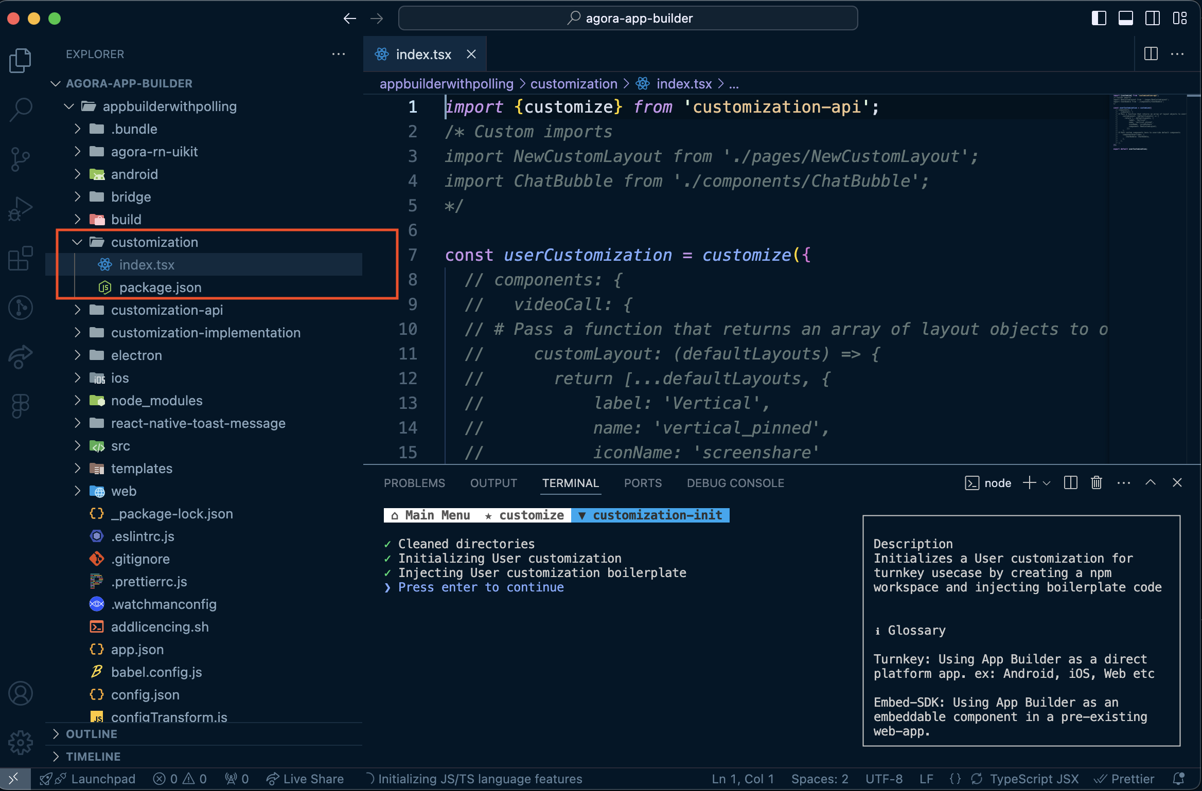
Once you've completed the setup, your project structure should include a customization folder, as shown below. This is where we will implement the polling feature
Preview: What We'll Build
Here’s a quick look at what the polling feature will look like once we’ve completed the guide and integrated it into our project. Watch this short demo video to see how users can:
- Create a poll within a video call session.
- Submit their votes in real time.
- View the results of the poll after submission.
- Perform actions like deleting poll, finishing poll, or publishing poll results.
Demo
Lets begin building Polling feature:
Step 1: Customize the bottom toolbar
Objective: Add a "Poll" button to the bottom toolbar, which will open a Poll side panel for managing polls when clicked.
Begin by making the necessary customizations in the index.ts file located inside the customization folder. As of now, this file has no customizations applied.
Resulting UI
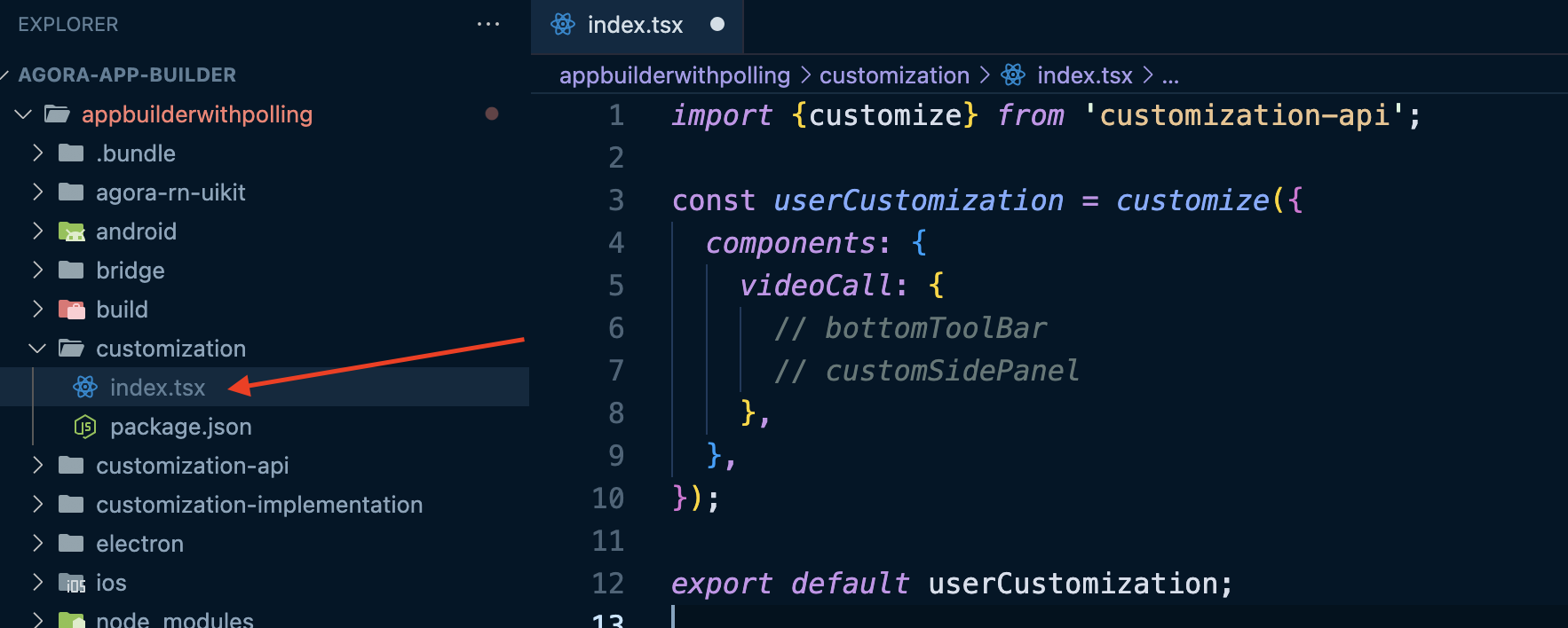
Step 1.1: Create a new file called CustomBottomToolBar.tsx inside the customization folder
We'll define a new bottom toolbar component that includes a Poll button.
import { ToolbarPreset } from "customization-api";
import React from "react";

const CustomBottomBar = () => {
  return (
    <ToolbarPreset
      align="bottom"
      items={{
        poll: {
          align: "center",
          label: "Polls",
          // component: PollButtonWithSidePanel,
        },
      }}
    />
  );
};

export default CustomBottomBar;
Step 1.2: Add the Poll Button to the Custom Bottom Toolbar
Let's modify the CustomBottomToolBar.tsx file to include a poll button that opens a side panel when clicked. We'll pass this button component as a value to the component property in the ToolbarPreset.
import {
  ToolbarPreset,
  ToolbarItem,
  TertiaryButton,
  useSidePanel,
} from "customization-api";
import React from "react";

export const POLL_SIDEBAR_NAME = "poll-side-pane;";

const PollButtonWithSidePanel = () => {
  const { setSidePanel } = useSidePanel();

  return (
    <ToolbarItem style={style.toolbarItemStyle as any}>
      <TertiaryButton
        containerStyle={style.containerStyle}
        textStyle={style.textStyle as any}
        text="Poll"
        onPress={() => {
          setSidePanel(POLL_SIDEBAR_NAME);
        }}
      />
    </ToolbarItem>
  );
};

const CustomBottomBar = () => {
  return (
    <ToolbarPreset
      align="bottom"
      items={{
        poll: {
          align: "center",
          label: "Polls",
          component: PollButtonWithSidePanel,
        },
      }}
    />
  );
};

export default CustomBottomBar;

const style = {
  toolbarItemStyle: {
    position: "relative",
  },
  containerStyle: {
    padding: 10,
  },
  textStyle: {
    fontWeight: "600",
    fontSize: 14,
    lineHeight: 14,
    color: "white",
  },
};
Step 1.3: Integrate the Custom Bottom Toolbar
Now, we'll integrate the CustomBottomBar.tsx by passing it into the customize function. This allows us to override the default toolbar in the VideoCall interface.
import { customize } from "customization-api";
import CustomBottomBar from "./CustomBottomToolBar";
import React from "react";

const userCustomization = customize({
  components: {
    videoCall: {
      bottomToolBar: CustomBottomBar,
    },
  },
});

export default userCustomization;
Resulting UI

Step 1.4: Create the Poll SidePanel
Now, let's create a minimal Poll SidePanel component. This sidepanel will display when the Poll button in the bottom bar is clicked.
import React from "react";

const PollSidebar: React.FC = () => {
  return <div style={{ color: "#fff" }}>This is poll sidebar</div>;
};

export default PollSidebar;
Step 1.5: Integrate Poll SidePanel
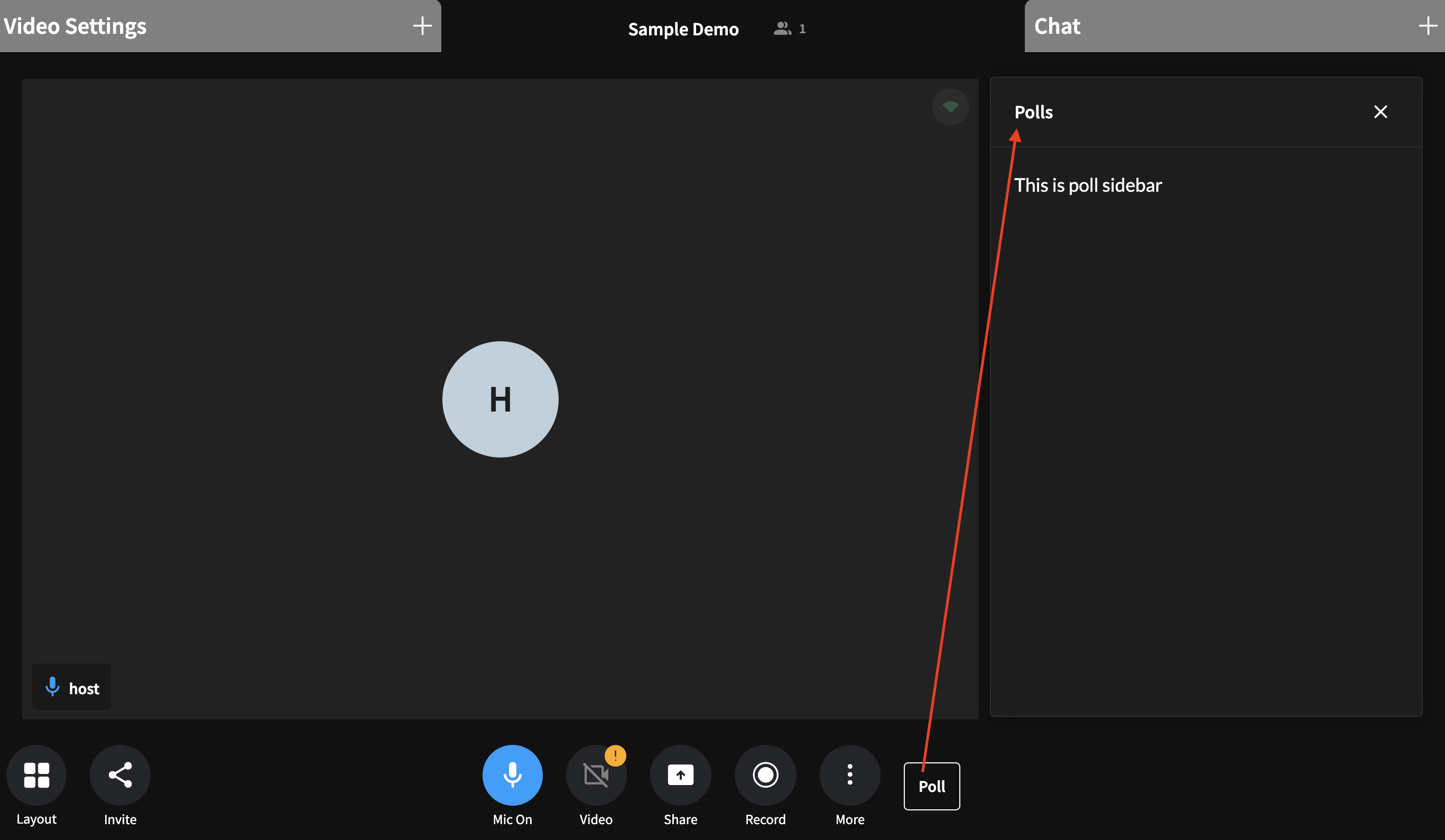
Now, we’ll enhance the videoCall interface by adding a custom sidepanel. This ensures that when the "Poll" button is clicked, the custom side panel for managing polls will appear.
import { customize } from "customization-api";
import CustomBottomBar, { POLL_SIDEBAR_NAME } from "./CustomBottomToolBar";
import PollSidebar from "./PollSidebar";
import React from "react";

const userCustomization = customize({
  components: {
    videoCall: {
      bottomToolBar: CustomBottomBar,
      customSidePanel: () => {
        return [
          {
            name: POLL_SIDEBAR_NAME,
            component: PollSidebar,
            title: "Polls",
            onClose: () => {},
          },
        ];
      },
    },
  },
});

export default userCustomization;
Resulting UI
Step 2: Adding a "Create Poll" Button to the Poll Sidebar
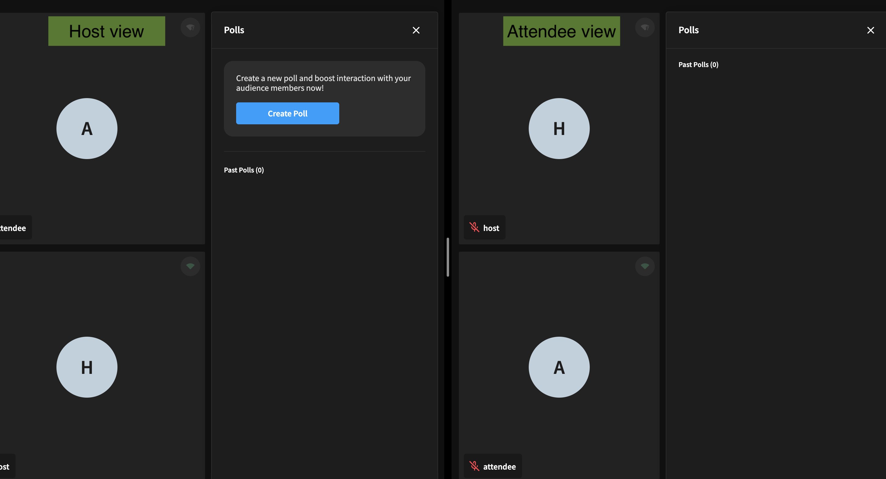
Initially, this button will be visible to all users, but it will eventually be restricted to the host of the channel. For now, let's focus on setting up the flow for creating a poll. We can add the necessary business logic and conditions later to ensure only the host can initiate the poll creation process.
Edit file PollSidebar.tsx to import buttons and config files from customization-api package.
import React from "react";
import { PrimaryButton, ThemeConfig, $config } from "customization-api";

export const POLL_SIDEBAR_NAME = "side-panel-poll";

const PollSidebar: React.FC = () => {
  return (
    <div style={style.pollSidebar}>
      <div style={style.headerSection}>
        <div style={style.headerCard}>
          <p style={style.bodyXSmallText}>
            Create a new poll and boost interaction with your audience members
            now!
          </p>
          <div>
            <PrimaryButton
              containerStyle={style.btnContainer}
              textStyle={style.btnText}
              onPress={() => startPollForm()}
              text="Create Poll"
            />
          </div>
        </div>
      </div>
      <div style={style.separator} />
    </div>
  );
};

const style: { [key: string]: React.CSSProperties } = {
  pollSidebar: {
    backgroundColor: $config.CARD_LAYER_1_COLOR,
  },
  headerSection: {
    display: "flex",
    flexDirection: "column",
    alignItems: "center",
    justifyContent: "center",
  },
  headerCard: {
    display: "flex",
    flexDirection: "column",
    justifyContent: "center",
    alignItems: "flex-start",
    gap: "16px",
    padding: "20px",
    backgroundColor: $config.CARD_LAYER_3_COLOR,
    borderRadius: "15px",
  },
  bodyXSmallText: {
    color: $config.FONT_COLOR + ThemeConfig.EmphasisPlus.medium,
    fontSize: ThemeConfig.FontSize.small,
    fontFamily: ThemeConfig.FontFamily.sansPro,
    fontWeight: 400,
    lineHeight: "16px",
  },
  btnContainer: {
    minWidth: "150px",
    height: "36px",
    borderRadius: "4px",
    padding: "10px 8px",
  },
  btnText: {
    color: $config.FONT_COLOR,
    fontSize: ThemeConfig.FontSize.small,
    fontFamily: ThemeConfig.FontFamily.sansPro,
    fontWeight: 600,
    textTransform: "capitalize",
  },
  separator: {
    margin: "24px 0",
    height: "1px",
    display: "flex",
    backgroundColor: $config.CARD_LAYER_3_COLOR,
  },
};

export default PollSidebar;
Resulting UI
Step 3: Building the Poll Creation Form UI
Let's design the user interface that allows the host to input poll details. This form will capture the necessary poll information, which will then be shared with all attendees in the session.
In this example, we’ll add support for creating a Multiple Choice Question (MCQ) poll, but the same approach can be used to build forms for other poll types as well.
Step 3.1 Poll structure
The poll state structure which we will be using is as follows
interface PollItemOptionItem {
  text: string; // The display text for the poll option.
  value: string; // A unique identifier for the option.
  votes: Array<{ uid: number; timestamp: number }>; // An array that stores participants user ID (uid) and timestamp who voted for this specific option.
  percent: string; // The percentage of total votes this option has received.
}
interface PollItem {
  id: string; // A unique identifier for the poll.
  status: "ACTIVE" | "FINISHED"; //  The current state of the poll
  question: string; // The poll question to be answered by participants.
  answers: Array<{
    uid: number;
    response: string;
    timestamp: number;
  }> | null; //  An array of participant responses, each containing the user ID, the participant's answer to the question, and the corresponding timestamp.
  options: Array<PollItemOptionItem> | null; // Array of multiple-choice options (PollItemOptionItem) if it's an MCQ poll.
  multiple_response: boolean; // A boolean indicating if multiple responses are allowed.
  createdBy: number; // The unique ID of the poll creator.
}

type Poll = Record<string, PollItem>;
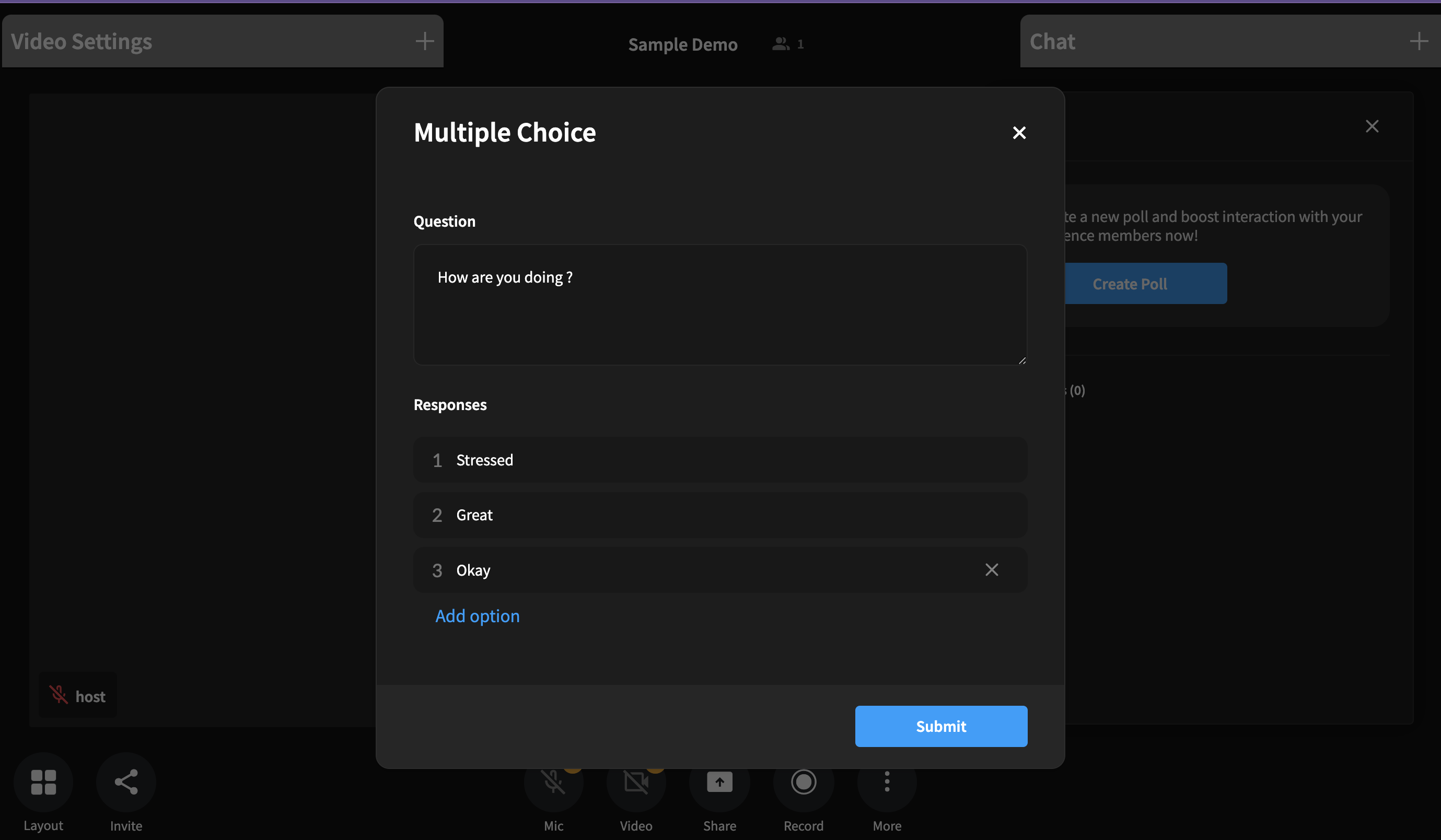
Step 3.2 Create the MCQ Form and Capture User Input
When the host clicks the "Create Poll" button, we capture the input from the form to populate the following object:
"randomPollId" = {
  id: "randomPollId",
  type: PollKind.MCQ,
  access: PollAccess.PUBLIC,
  status: PollStatus.LATER,
  question: "",
  answers: null,
  options: [
    {
      text: "",
      value: "",
      votes: [],
      percent: "0",
    },
    {
      text: "",
      value: "",
      votes: [],
      percent: "0",
    },
    {
      text: "",
      value: "",
      votes: [],
      percent: "0",
    },
  ],
  multiple_response: true,
  share: false,
  duration: false,
  expiresAt: 0,
  createdBy: -1,
};
The above object serves as the structure for capturing user input in the poll creation form. As the host fills in the poll details, such as the question and options, the data is stored in this object. Once the host has finished editing the poll, they can send this poll by clicking on submit button.
Resulting UI
This is what the form UI will look like when clicked on "Create Poll" button.
Step 4: Sending the poll
After the host completes the poll creation process and submits the form, the poll data must be broadcasted to all participants.
In this step, we'll implement the logic to send the the poll data collected from the form to all attendees in the session using custom events.
We use persistence level PersistenceLevel.Channel for sending this event because it ensures that events are stored persistently and can be accessed even after all users have left the channel. This allows new users joining the channel to read the stored meta state and update their own state accordingly.
Note: The event will be eventually cleared if the channel remains empty (has no members) for a couple of minutes.
import { customEvents, PersistanceLevel } from "customization-api";

const sendPollEvt = (polls: Poll, pollId: string) => {
  customEvents.send(
    "POLLS",
    JSON.stringify({
      state: { ...polls },
      action: "SEND_POLL",
      pollId: pollId,
    }),
    PersistanceLevel.Channel
  );
};
Step 5: Receiving the poll
Once the poll is sent by the host, all participants in the session need to be able to receive and interact with it.
In this step, we’ll subscribe to the poll event. Once the poll event is received, the UI is updated to display the poll. Participants can then submit their votes.
Step 5.1: Subscribe to the poll event
import { customEvents, PersistanceLevel } from "customization-api";

useEffect(() => {
  customEvents.on("POLLS", (args) => {
    // const {payload, sender, ts} = args;
    const { payload } = args;
    const data = JSON.parse(payload);
    const { action, state, pollId, task } = data;
    switch (action) {
      case "SEND_POLL":
        // Perform necessary actions when attendee receive the poll
        // onPollReceived
        break;
      default:
        break;
    }
  });

  return () => {
    customEvents.off("POLLS");
  };
}, [onPollReceived]);
Step 5.2: Display the Poll Form
const onPollReceived = (
  newPoll: Poll,
  pollId: string,
  task: PollTaskRequestTypes
) => {
  // Sync your state with incoming poll data and existing poll data
  const mergedPolls = syncPolls(newPoll, polls);

  if (isHost) {
    // sync state
  } else if (isAttendee) {
    Object.entries(mergedPolls).forEach(([_, pollItem]) => {
      if (pollItem.status === PollStatus.LATER) {
        return;
      }
      savePoll(pollItem);
      if (pollItem.status === PollStatus.ACTIVE) {
        // If status is active but attendee has already voted do not show the form
        if (hasUserVoted(pollItem.options || [], localUid)) {
          return;
        }
        // if status is active but attendee has not voted
        // 1. Open the form for attendees so that they can vote
        setCurrentModal(PollModalState.RESPOND_TO_POLL);
      }
    });
  }
};
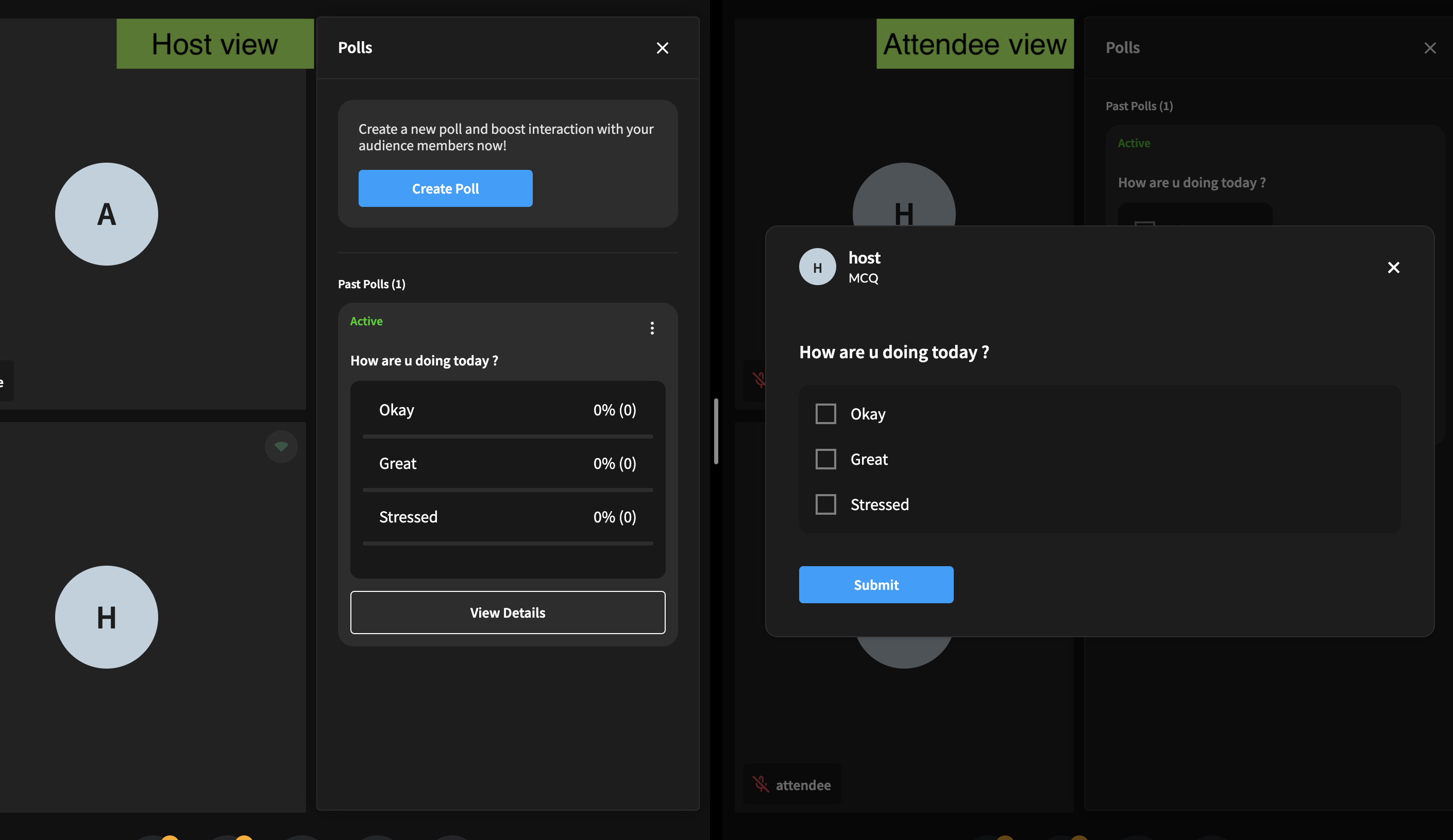
Step 5.3: Respond to the Poll
The poll object is updated with the user's response. Whenever a user selects an option, their choice is recorded, and the selected option's votes array is updated with the user's details (such as uid and timestamp).
For example, if a user selects an option, the votes array in the corresponding option object is modified like this:
options: [{
  text: "Okay",
  value: "okay",
  votes: [
    { uid: 12345, timestamp: 1625498765 },  //  vote added here
    ...
  ],
  percent: "50",
}
{
  text: "Great",
  value: "great",
  votes: [
    { uid: 12345, timestamp: 1625498765 },  //  vote added here
    ...
  ],
  percent: "50",
}]
Resulting UI
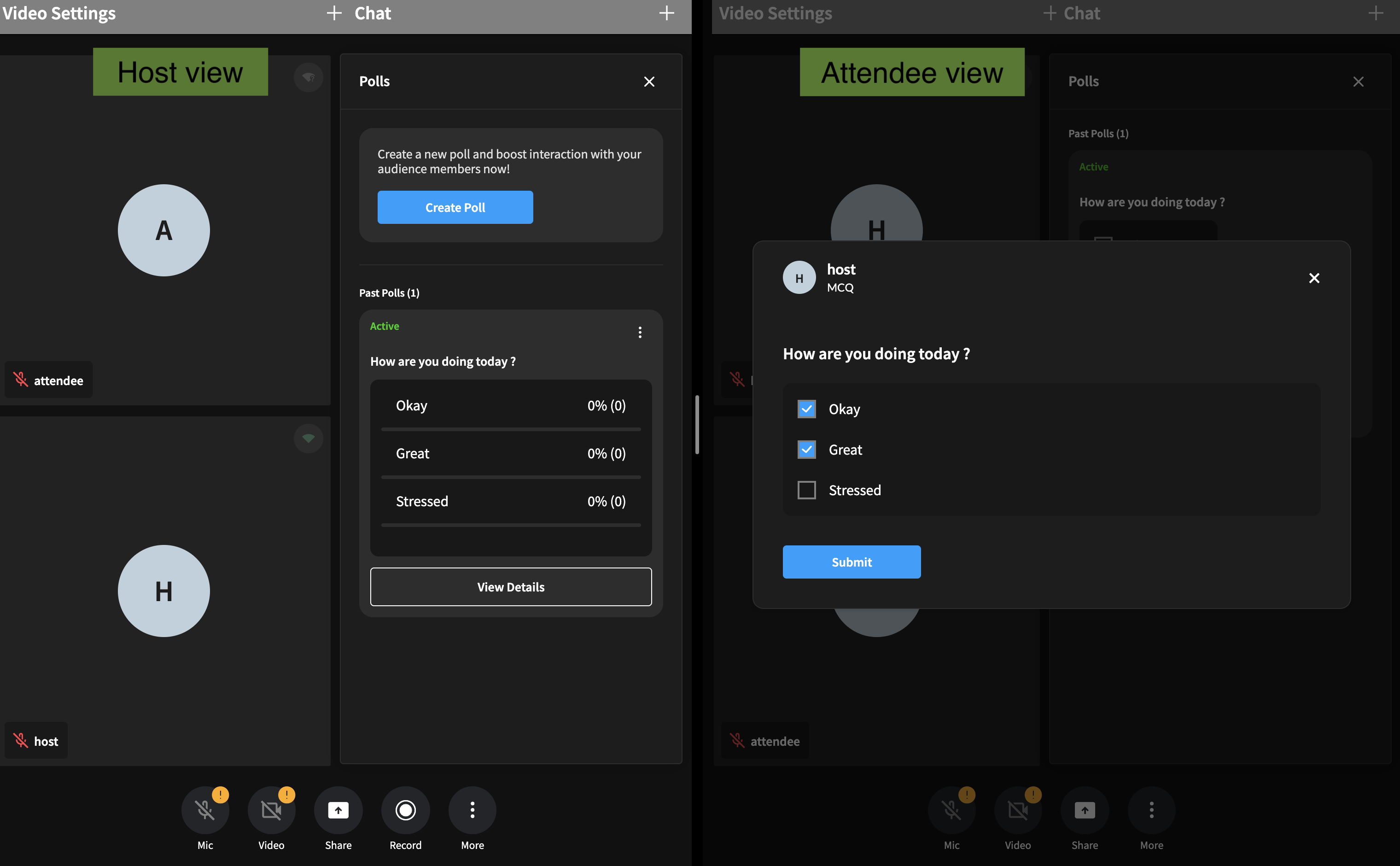
Step 6: Submiting the poll response
Once an attendee selects an option and submits their vote, the poll response is processed and sent to the host in the channel
This is achieved using custom events within the customization API, which allows you to send messages to all participants in the session.
Based on the scope, we can opt to send the poll results either directly to the host who created the poll or to all users in the channel if multiple hosts are present. If the results are sent to everyone, the poll data can later be processed according to the recipient’s role—whether they are a host or an attendee.
We use PersistenceLevel.None for this event because we don't need to persist every response. Instead, we want to send it as a direct, non-persistent message. As all attendees will be submitting their own responses, we do not want to clutter by storing this event.
import { customEvents, PersistanceLevel } from 'customization-api';

const sendResponseToPoll = (
  pollId,
  responses,
  uid,
  timestamp
) => {
  customEvents.send(
    "POLL-RESPONSE,
    JSON.stringify({
      pollId,
      responses,
      uid,
      timestamp,
    }),
    PersistanceLevel.None
  );
};
Resulting UI
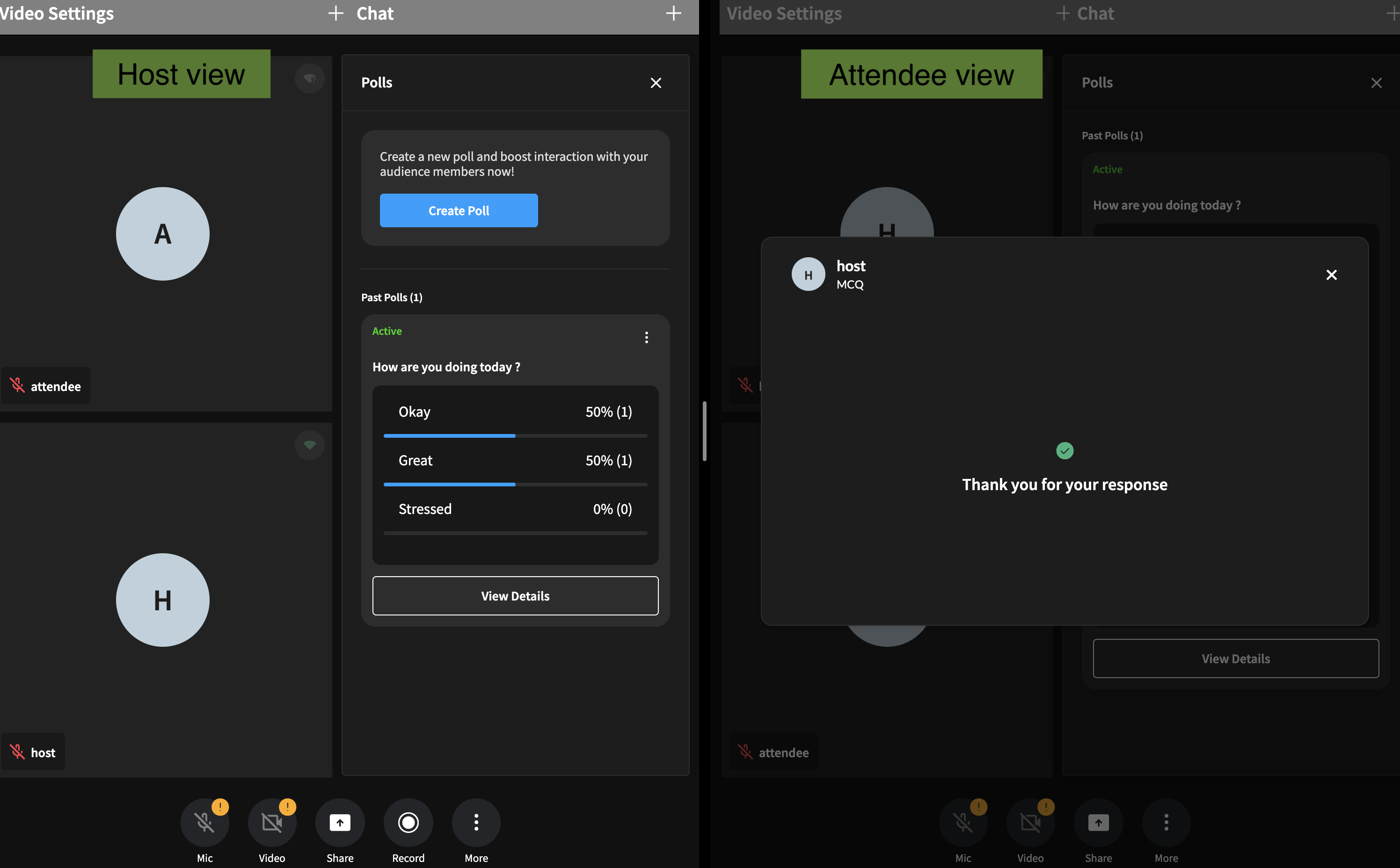
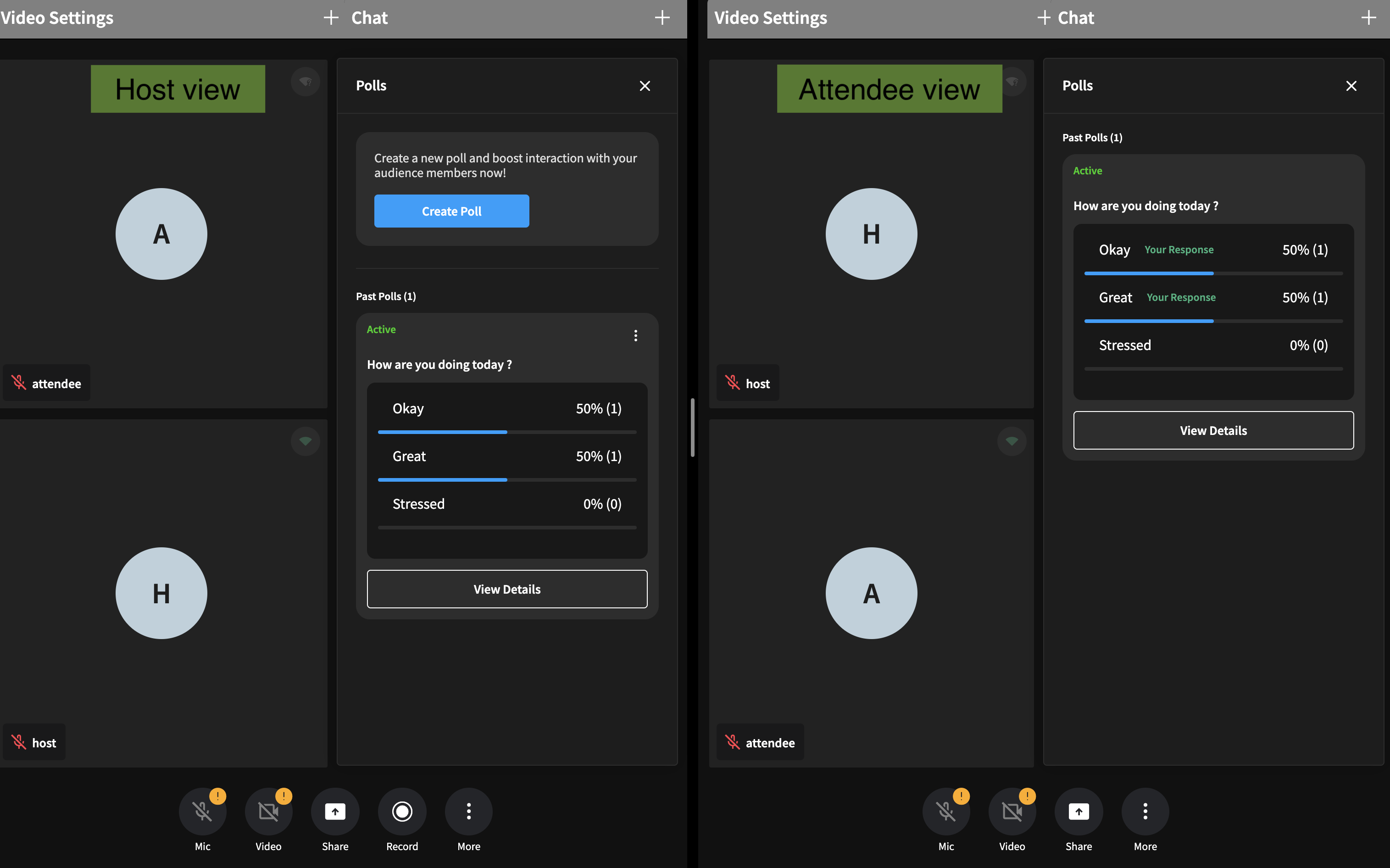
Step 7: Host receives the responses and synchronizes the poll state
Once an attendee submits their vote, all hosts in the channel need to receive and process it to update their poll states accordingly.
Step 7:1 Subscribe to the poll-response event
In this step, we’ll subscribe to the POLL-RESPONSE event. When a poll response is received, the UI will be updated to reflect the new vote and percentage:
import { customEvents, PersistanceLevel } from "customization-api";

useEffect(() => {
  customEvents.on("POLL-RESPONSE", (args) => {
    const { payload } = args;
    const data = JSON.parse(payload);
    const { id, responses, uid, timestamp } = data;
    // Handle poll response here
    // onPollResponseReceived(id, responses, uid, timestamp);
  });

  return () => {
    customEvents.off("POLL-RESPONSE");
  };
}, [onPollResponseReceived]);
Step 7.2: Implementing Helper Functions addVote and calculatePercentage
These helper functions will handle the logic of updating the votes and recalculating the percentages for each poll option:
function addVote(
  responses: string[],
  options: PollItemOptionItem[],
  uid: number,
  timestamp: number
): PollItemOptionItem[] {
  return options.map((option: PollItemOptionItem) => {
    // Count how many times the value appears in the strings array
    const exists = responses.includes(option.value);
    const isVoted = option.votes.find((item) => item.uid === uid);
    if (exists && !isVoted) {
      // Creating a new object explicitly
      const newOption: PollItemOptionItem = {
        ...option,
        ...option,
        votes: [
          ...option.votes,
          {
            uid,
            access: PollAccess.PUBLIC,
            timestamp,
          },
        ],
      };
      return newOption;
    }
    // If no matches, return the option as is
    return option;
  });
}

function calculatePercentage(
  options: PollItemOptionItem[]
): PollItemOptionItem[] {
  const totalVotes = options.reduce(
    (total, item) => total + item.votes.length,
    0
  );
  if (totalVotes === 0) {
    // As none of the users have voted, there is no need to calulate the percentage,
    // we can return the options as it is
    return options;
  }
  return options.map((option: PollItemOptionItem) => {
    let percentage = 0;
    if (option.votes.length > 0) {
      percentage = (option.votes.length / totalVotes) * 100;
    }
    // Creating a new object explicitly
    const newOption: PollItemOptionItem = {
      ...option,
      percent: percentage.toFixed(0),
    };
    return newOption;
  }) as PollItemOptionItem[];
}
Step 7.3: Recalculate Votes and Percentages, Update the UI
This function processes the poll responses, recalculates the votes, and updates the UI accordingly:
const onPollResponseReceived = (
  pollId: string,
  responses: string | string[],
  uid: number,
  timestamp: number
) => {
  const newCopyOptions = poll.options?.map((item) => ({ ...item })) || [];
  const withVotesOptions = addVote(responses, newCopyOptions, uid, timestamp);
  const withPercentOptions = calculatePercentage(withVotesOptions);
  return {
    ...state,
    [pollId]: {
      ...poll,
      options: withPercentOptions,
    },
  };
};
Resulting UI
Conclusion
By following this guide, we have successfully integrated a dynamic polling feature into our app.
We can extend the functionality to perform various actions on polls, such as:
- Finishing a Poll: Hosts can conclude a poll and stop further submissions.
- Viewing Poll Results: Attendees can see live results once the poll is completed or when the host publishes the results.
- Deleting a Poll: Hosts can remove a poll from the session entirely.
You can continue to enhance the polling feature with more actions, like editing polls or adding timed polls, depending on your project’s requirements.
Advanced Polling example can be found here: