Customization API Quickstart Guide
The following guide describes how to quickly get started with Customization API to modify your App Builder application.
As a showcase we will be exploring how to override the default ChatBubble component with our own component and adding a userbubble that displays the first character of the username alongside the chatbubble.
INITIALIZING
STEP 1
Download and extract the app builder source code, read more on how to do it here.
STEP 2
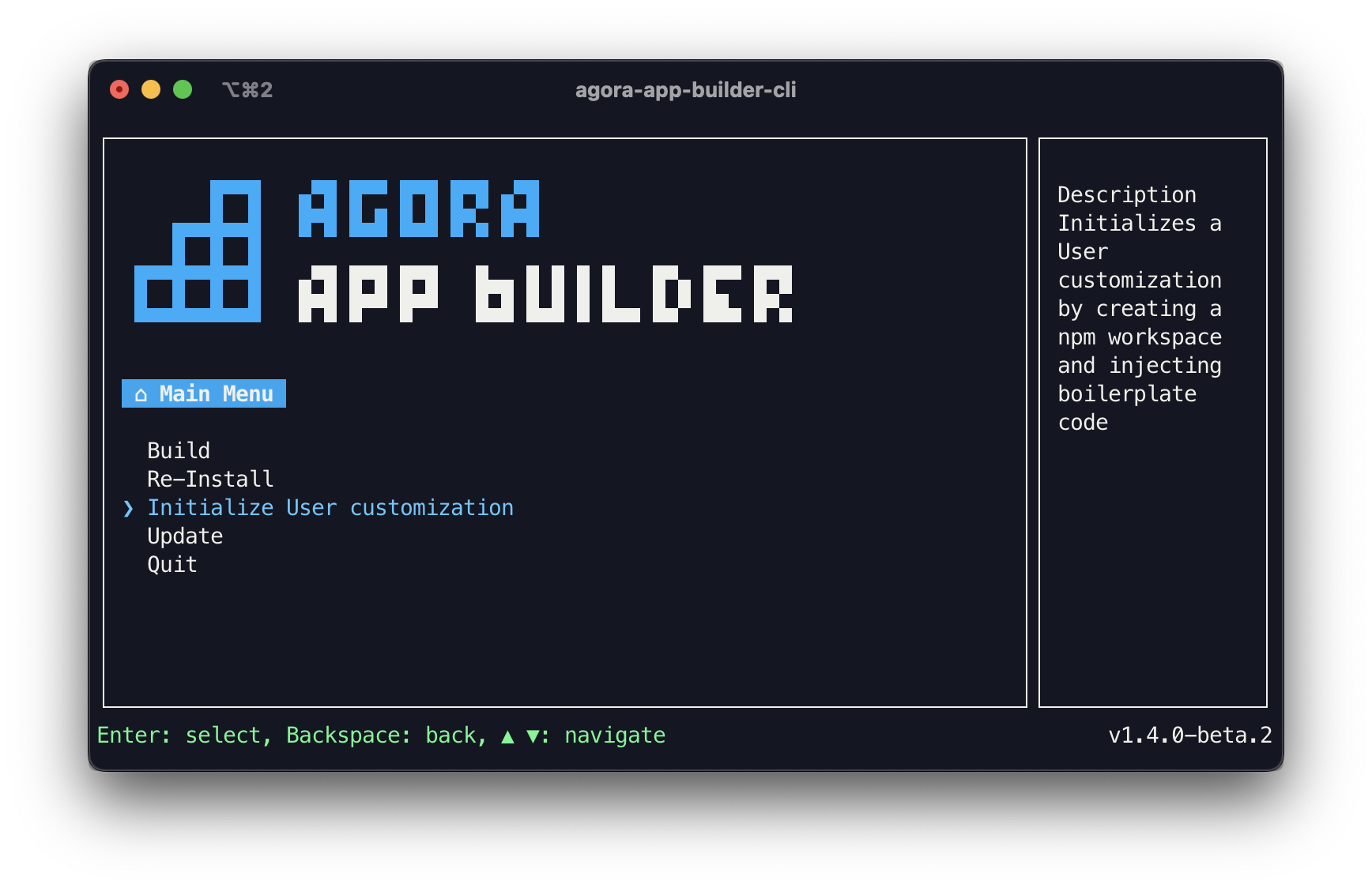
Run the agora-app-builder-cli in your project folder using the following command:
npm i && npm run start
STEP 3
Navigate using the arrow keys and select the Initialize User customization option using the enter key. After which the CLI will start the initialization.
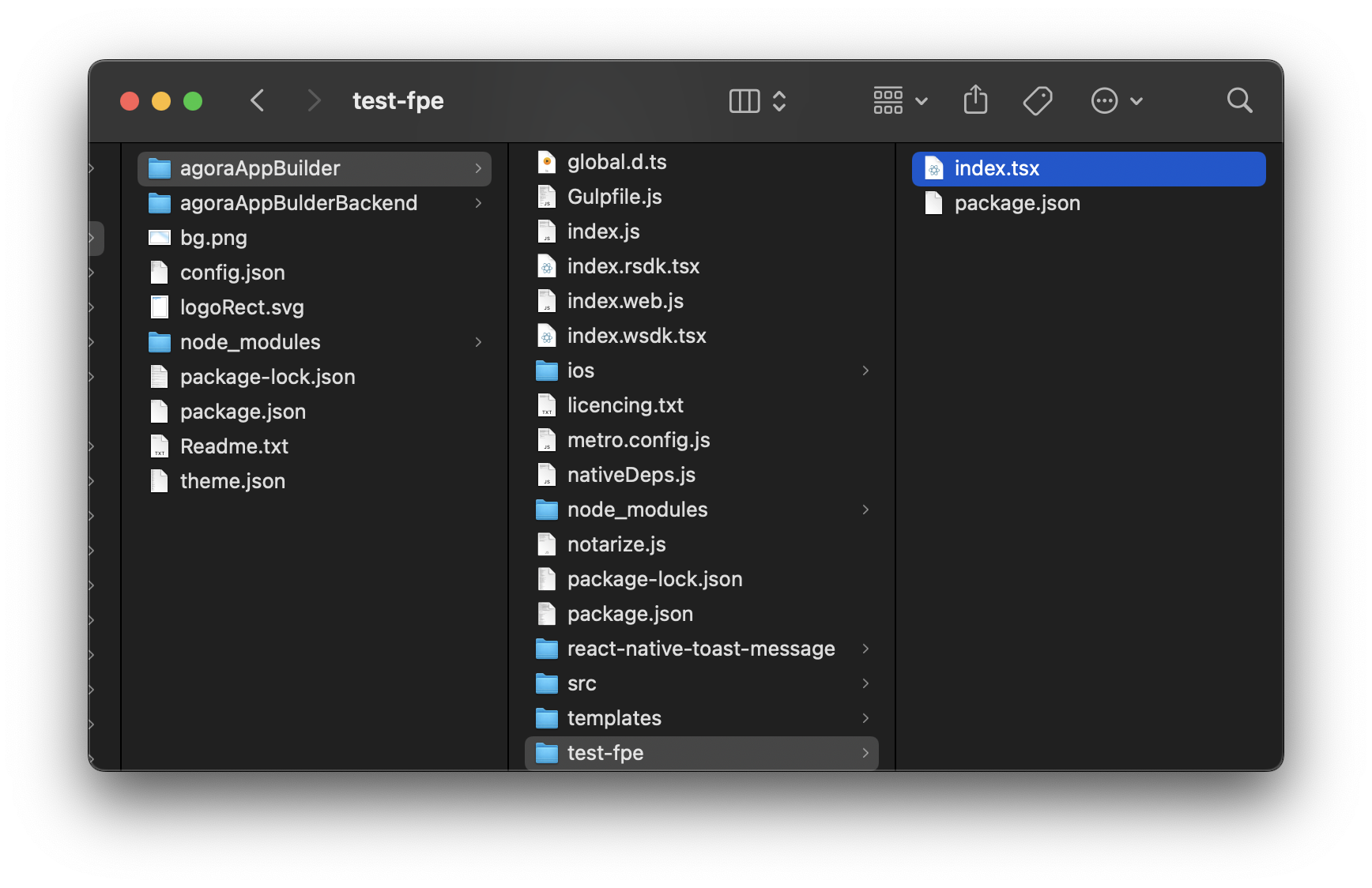
Once complete a boilerplate user-customization will be created inside <path-to-app-builder-project-folder>/<project-name>/customization/index.tsx.
USAGE EXAMPLE
Customization API is a set of APIs and Libraries that allow you to customize your App Builder project.
APIs are exposed under the customize method by passing an object with keys corresponding to the API you want to interact with. Whereas Libraries are available as imports under the customization-api namespace.
The following steps indicate an example customization by overriding the App Builder Chat Bubble component.
STEP 1
Open the index.tsx file present inside the newly created customization folder.
STEP 2
Create a component you want to override the default Chat Bubble component with.
import React from "react";

const ChatBubbleComponent = (props) => {
  return <></>;
};

export default ChatBubbleComp;
STEP 3
When passed as an override the component will receive props to display necessary information or perform necessary actions. We can refer to the api reference to see the props available to our component and destructure them for use.
import React from "react";

const ChatBubbleComponent = (props) => {
  const { uid, isLocal } = props;

  return <></>;
};

export default ChatBubbleComponent;
STEP 4
Once we have the props, we can fetch any other information like in our case we receive the message senders uid as prop however in UI it would be more helpful to show the displayName of the user. We can fetch any such information using the App state library the displayName in specific can be fetched from the Content app state
import React from "react";
import { useContent } from "customization-api";

const ChatBubbleComponent = (props) => {
  const { uid, isLocal } = props;

  // Get data from content app-state
  const { defaultContent } = useContent();

  // Fetch username using uid
  const displayName = defaultContent[uid].name;

  return <></>;
};

export default ChatBubbleComponent;
STEP 5
Since we only want to make a small modification to the UI we can reuse the default ChatBubbleComponent available to us along with various default components a part of the SubComponentsLibrary. We pass all the received props as is to the imported component.
import { ChatBubble, useContent } from "customization-api";
import React from "react";

const ChatBubbleComponent = (props) => {
  const { uid, isLocal } = props;

  // Get data from content app-state
  const { defaultContent } = useContent();

  // Fetch username using uid
  const displayName = defaultContent[uid].name;

  return <ChatBubble {...props} />;
};

export default ChatBubbleComponent;
STEP 6
Having all the needed information at hand we can start defining our UI. To fetch the colors defined by the App Builder theme in use we can import the config Library. We can also conditionally style our component using the isLocal flag received as prop.
import { ChatBubble, useContent, $config } from "customization-api";
import React from "react";
import { View, Text, StyleSheet } from "react-native";

const ChatBubbleComponent = (props) => {
  const { uid, isLocal } = props;

  // Get data from content app-state
  const { defaultContent } = useContent();

  // Fetch username using uid
  const displayName = defaultContent[uid].name;

  const {
    container,
    containerLocal,
    containerRemote,
    username,
    usernameLocal,
    usernameRemote,
  } = styles;

  return (
    <View style={[container, isLocal ? containerLocal : containerRemote]}>
      <View style={[username, isLocal ? usernameLocal : usernameRemote]}>
        <Text
          style={{ fontWeight: "bold", color: isLocal ? "white" : "black" }}
        >
          {displayName.slice(0, 1)}
        </Text>
      </View>
      <View style={{ maxWidth: "80%" }}>
        <ChatBubble {...props} />
      </View>
    </View>
  );
};

const styles = StyleSheet.create({
  container: {
    display: "flex",
    flex: 1,
    alignItems: "flex-end",
  },
  containerLocal: {
    flexDirection: "row-reverse",
  },
  containerRemote: {
    flexDirection: "row",
  },
  username: {
    height: 32,
    width: 32,
    borderRadius: 16,
    display: "flex",
    alignItems: "center",
    justifyContent: "center",
    marginBottom: "5px",
  },
  usernameLocal: {
    marginLeft: -10,
    marginRight: 5,
    backgroundColor: $config.PRIMARY_COLOR,
  },
  usernameRemote: {
    marginLeft: 5,
    marginRight: -10,
    backgroundColor: $config.PRIMARY_FONT_COLOR + "20",
  },
});

export default ChatBubbleComponent;
STEP 7
We call the customize method and pass an object with the necessary keys. Since we want to override the Chat Bubble component our object should look like so based on the Api Reference.
import { customize } from "customization-api";

import MyChatBubbleComponent from "./components/MyChatBubbleComponent";

const userCustomization = customize({
  components: {
    videoCall: {
      chat: {
        chatBubble: MyChatBubbleComponent,
      },
    },
  },
});

export default userCustomization;
STEP 8
Finally we export our customization generated by the customize method to allow App Builder to apply it.
import { customize } from "customization-api";

import MyChatBubbleComponent from "./components/MyChatBubbleComponent";

const userCustomization = customize({
  components: {
    videoCall: {
      chat: {
        chatBubble: MyChatBubbleComponent,
      },
    },
  },
});

export default userCustomization;
STEP 9
You should now see your customization applied to App Builder when you build your project.
CONCLUSION
We now have successfully customized our chat bubble component and added a username bubble before every message. You can check out the code here